Rather than having an urban fabric based on spatial definition by buildings, landscape would be the 'structuring medium.' The 'look and shape of the city' was to be a matter of 'open space within which buildings are set'.It didn't work the first time; it's not going to work again.

Crossing the Lines: Site, Urban, Environmental, and Transportation Planning
Showing posts with label Urban Design. Show all posts
Showing posts with label Urban Design. Show all posts
Wednesday, March 26, 2014
The Definition of Insanity
From Landscape Urbanism and its Discontents, courtesy Envision Baltimore:


Tuesday, March 4, 2014
Urbanizing 30th St.
Back in September 2012 I wrote a post called The Space Between, in which I detailed urban design treatments linking the Penn and Drexel campuses together by extending the very successful Drexel platform a block further. I also proposed, more daringly, that the High Line be treated as the spine of a boulevard running from Penn Park up to JFK Boulevard, framing and defining a neighborhood-defining space.
The gist of this post is that: (1) Penn and Drexel ought to cooperate to extend the 32nd St. greenway/cap south to Walnut, (2) Penn needs to redevelop the 3201 Walnut garage, which has some cool features but is horrendous at street level, (3) it also needs to redevelop Rittenhouse Labs' Walnut streetwall, and (4) both have more to gain using the (quite active) High Line to define a 31st Street boulevard than mooning over a park proposal that ain't never gonna happen*. The Space Between also defines the key infrastructural and public-sector moves needed to fully urbanize the 30th Street area.
However, this area has two wings. Let us focus first on the south wing, defined by Penn Park.
Fairly large chunks of the park, most famously the parking lot along Walnut, but also self-evidently the parking lot and disused greenswards anti-framing South, are land bank. The park was created in general to (1) sponge up and (2) help focus development around Penn's vast Schuylkill banks land bank.
But there is a second element, not as much considered: The park lies between the train tracks. While it is difficult to justify covering the western ones--at least until (unless) the Class of 1923 Ice Rink and Levy Tennis Pavilion plots are redeveloped--the Schuylkill's heavy traffic suggests that an extension of the surface avenue atop it to South is warranted. This is Schuylkill Boulevard.
And with the Boulevard, we create a platform for development. Now 30th St.'s south approach isn't just Penn Park's east edge, it's also very precious developable space sitting between it and Schuylkill Boulevard. This plan capitalizes on that by capping the NEC with five blocks--split by greenways--four of which would hold development, and one an extension of Penn Park to the river. A pedestrian bridge would also connect across the Schuylkill, onto the CSX crossing's west abutment, adding a valuable river link to these amenities. Finally, the 100 block of Schuylkill Ave. is highlighted (as if it couldn't be any more) as very valuable, riverfront, parkside developable space. Let's call this "Penn Park Place".
Between the space between and Penn Park Place, we have a relatively complete roadmap for redeveloping the 30th St. area: extend existing improvements south and east, and allow Penn (preferably in partnership) to redevelop the many banked parcels it owns; redevelop air rights on the riverside parcels.
Finally, let us consider Powelton Yards, the vast coach yards north of 30th St. Station. Above is the site schematic produced for Drexel's master plan; below, I translate (and expand on) the general idea in a Google Maps map. Powelton Yards is a truly vast area: capping it would yield some 30 blocks of space. The height needed to clear 30th St.'s west approach, in the southwest corner, would create an artificial hillock, hence the name I've given this area as a neighborhood: Schuylkill Hill.
Between the core 30th St. area (including the Innovation Neighborhood), Penn Park Place, and Schuylkill Hill, a fairly extensive gull-winged western extension of the city core is taking shape. Let us hope that we fix the mistakes of our past, and don't make new ones we'll come to regret.
_____________
*Short of sinking billions of dollars into a bypass.
 |
| The Space Between: Red is Drexel, Yellow UPenn, blue commercial, purple residential. Green is greenspace, and those two blue lines show the build-to lines framing 31st St. Boulevard. |
However, this area has two wings. Let us focus first on the south wing, defined by Penn Park.
 |
| Around Penn Park. The park is in green; blue is 100 Schuylkill; purple, proposed residential on air rights; yellow, Penn's land bank. In black note the extension of Schuylkill Boulevard atop the Schuylkill Expressway. |
But there is a second element, not as much considered: The park lies between the train tracks. While it is difficult to justify covering the western ones--at least until (unless) the Class of 1923 Ice Rink and Levy Tennis Pavilion plots are redeveloped--the Schuylkill's heavy traffic suggests that an extension of the surface avenue atop it to South is warranted. This is Schuylkill Boulevard.
And with the Boulevard, we create a platform for development. Now 30th St.'s south approach isn't just Penn Park's east edge, it's also very precious developable space sitting between it and Schuylkill Boulevard. This plan capitalizes on that by capping the NEC with five blocks--split by greenways--four of which would hold development, and one an extension of Penn Park to the river. A pedestrian bridge would also connect across the Schuylkill, onto the CSX crossing's west abutment, adding a valuable river link to these amenities. Finally, the 100 block of Schuylkill Ave. is highlighted (as if it couldn't be any more) as very valuable, riverfront, parkside developable space. Let's call this "Penn Park Place".
 |
| 30th St. and Penn Park, with Drexel in red, Penn in yellow, commercial in blue, and residential in purple. |
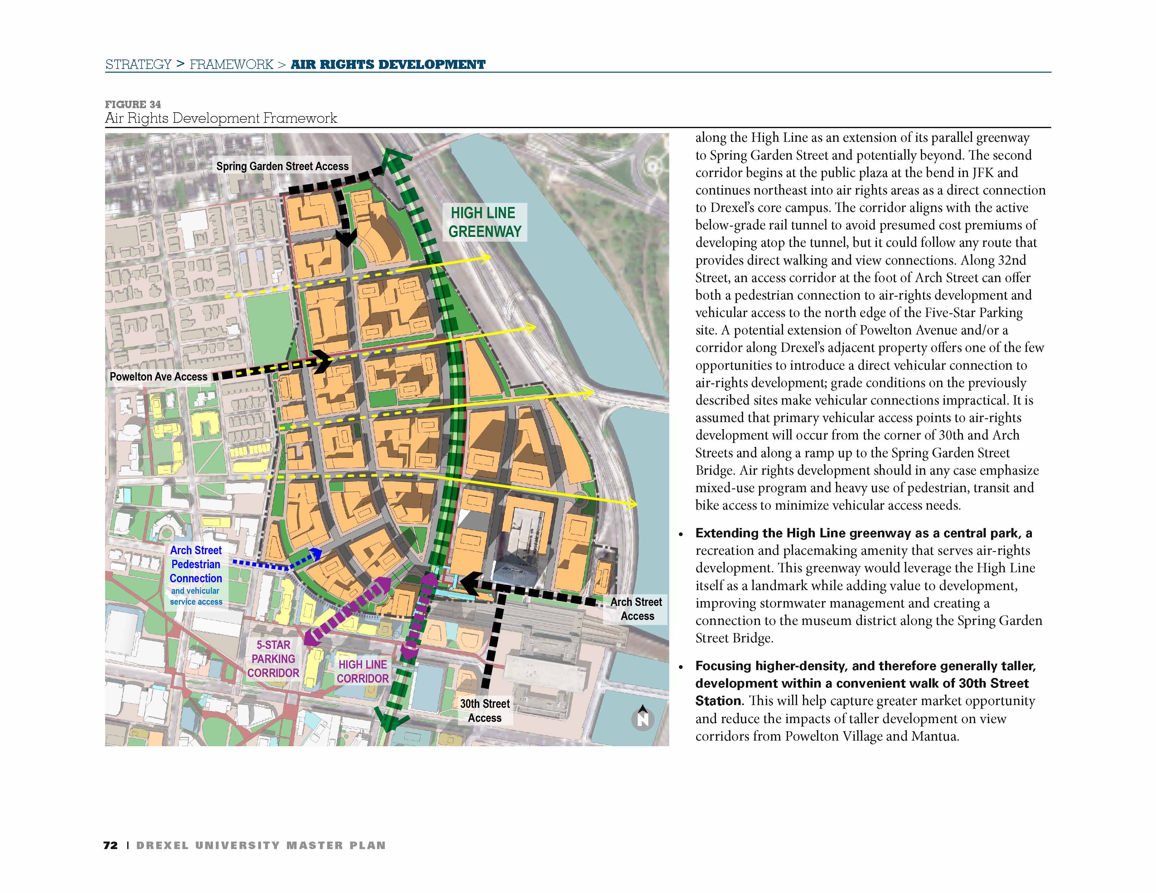 |
| Powelton air rights, from Drexelmasterplan |
 |
| Schuylkill Hill. Blue are the Drexel Master Plan parcels; yellow, my extensions; red, the DMP streets; sky blue, my extensions; and green is parks and berms. |
_____________
*Short of sinking billions of dollars into a bypass.
Monday, March 3, 2014
Capping Vine Redux
Remember this post? Remember this picture?
 Well, with the new Mormon apartment building, I thought I'd bring it back to life, and put more meat on them bones.
 Here we see, in purple, the major developments near Vine between Broad and Logan Square: the Mormon Temple, their Meetinghouse, the new apartment building at 1601 Vine, the Provence, and the apartment buildings buttressing Broad and Callowhill. Under it, we see the old cap plan. Intermingled with these, we also have some additions: several mews structures to take advantage of the increased desirability, and a small park over the exit ramp at 15th and Vine.
In the cloverleaf, we build a new "Sydenham Mall" (Sydenham being the name of the interstitial street between 15th and 16th); flanking it, large buildings fronting each of the four corners. They would share mechanicals and loading docks in the cloverleaf curve; inasmuch as possible, they would cover the interchange. Retail fronting Sydenham would lead up to the Provence*; retail fronting 16th would help urbanize that street further; flex space would front 15th.
Between all of these additions, the Vine Street Expressway would be completely hidden from 12th to 21st-ish. It would become the perfect example of the proper placement of heavy transportation infrastructure in the city--grade-separated, out of mind.**
___________
*If the Provence is built. As you may recall, I noted in A Provincial "Provence" that turning the cloverleaf green is, in fact, the worst possible for it.
**Remember, in Death and Life, Jane Jacobs noted that the most marginal uses--and hence the worst land values--were (in her time) usually located next to railroad tracks; this can be expanded to include Interstates today, for various reasons. Both are heavy infrastructure. The fact of the matter is that heavy transportation infrastructure, while indubitably necessary for the city to function properly (to get imports in and exports out à la her economies trilogy), also have a depressing effect on adjacent land. My extension of this point is--one of planning's major goals should thus be minimization of this effect by making heavy transpo infra "invisible" from an urban-dynamics point of view.
In the cloverleaf, we build a new "Sydenham Mall" (Sydenham being the name of the interstitial street between 15th and 16th); flanking it, large buildings fronting each of the four corners. They would share mechanicals and loading docks in the cloverleaf curve; inasmuch as possible, they would cover the interchange. Retail fronting Sydenham would lead up to the Provence*; retail fronting 16th would help urbanize that street further; flex space would front 15th.
Between all of these additions, the Vine Street Expressway would be completely hidden from 12th to 21st-ish. It would become the perfect example of the proper placement of heavy transportation infrastructure in the city--grade-separated, out of mind.**
___________
*If the Provence is built. As you may recall, I noted in A Provincial "Provence" that turning the cloverleaf green is, in fact, the worst possible for it.
**Remember, in Death and Life, Jane Jacobs noted that the most marginal uses--and hence the worst land values--were (in her time) usually located next to railroad tracks; this can be expanded to include Interstates today, for various reasons. Both are heavy infrastructure. The fact of the matter is that heavy transportation infrastructure, while indubitably necessary for the city to function properly (to get imports in and exports out à la her economies trilogy), also have a depressing effect on adjacent land. My extension of this point is--one of planning's major goals should thus be minimization of this effect by making heavy transpo infra "invisible" from an urban-dynamics point of view.
Thursday, February 27, 2014
Link Link Linky Link
Check out this PDF if you've got the time: http://www.pike-pine.org/download/Pike-Pine-Renaissance-Design-Vision.pdf
One of the more enlightened urban design proposals to come out--Of particular note, note that its intersection treatment is global speed tables. While in my own practice I favor bumpouts, I don't disagree with the idea that tables will work.
One of the more enlightened urban design proposals to come out--Of particular note, note that its intersection treatment is global speed tables. While in my own practice I favor bumpouts, I don't disagree with the idea that tables will work.
Thursday, February 20, 2014
Urban Design Must Be Becoming Mainstream...
...because once something becomes mainstream, it's going to be perverted, and Jannie Blackwell's proposal is about as extreme a perversion of urban design as it gets...
 ...using urban design as a tool to prevent any redevelopment on any property whatsoever without getting a variance.
Wednesday, February 19, 2014
Three Links
Apex Urbanism is another excellent blog in the old urbanist vein, heavily influenced by Nathan Lewis and Charlie Gardner. Still fresh, it's worth checking out.
A local blogger puts out Munson's City--lots of excellent and interesting ideas, critiques, etc.
Finally, check out the Allure of By-Lanes and Cobbled Streets Pinterest page. Beautiful photos of great urban places. This latter reminds us, especially in old urbanist contexts, how much modern regulation has actively hindered, not helped, placemaking.
A local blogger puts out Munson's City--lots of excellent and interesting ideas, critiques, etc.
Finally, check out the Allure of By-Lanes and Cobbled Streets Pinterest page. Beautiful photos of great urban places. This latter reminds us, especially in old urbanist contexts, how much modern regulation has actively hindered, not helped, placemaking.
Tuesday, February 11, 2014
Tuesday, November 6, 2012
A Pocket Park on Market East?
 |
| The St. Stephen's Square proposal for 10th and Market |
PREIT has bought out the former Gimbels at 901 Market--the one that's now a Kmart; the original Gimbels, where the Disney Hole now sits, was torn down some 30 years ago--from Vornado, and is rumored to be planning on a $300 million renovation--though investor documents make one worry they're going to beg for government handouts first (for whatever reason). Meanwhile, the 1000 block of Market offers two distinct, and opposing, directions for the area to take.
The first is the the new Marshall's, whose design makes it feel a tad smaller than it really is, but which has a wide array of merchandise in stock. Marshall's tends to be something of a fixture in stronger downtowns. The other is a new Lot Stores in the old Valu-Plus; Lot Stores are notoriously ultra-low-end, and represent the continuing inertia of the area as hands wring, companies beg for money, and bloggers and people in general complain about how the retail there really should be an order of magnitude better.
The hope is, with the Girard Square proposal and Gallery redevelopment, Market East will begin to firmly improve itself. With oodles of retail space available, it can successfully cater to the Great Middle--the big boxes, mall chains, and so on--but to do that, it needs to have people dedicated to that vision constantly working on it.
Anyway, now that I've written myself into a corner, I'm segueing (somehow) to an idea I've been kicking around for the commercial part of the 900 block of Market: a pocket park, a public gathering space at the corner of 10th and Market, where "Center City's Main Street" and the City's Main Street meet. The idea is like Toronto's Dundas Square at the corner of Yonge and Dundas: a small public space as a gateway, and a more formal and gracious addressing of one of eastern Center City's main intersections.
Aside from Dundas Square, inspirations are: Herald Square, New York; Union Square, San Francisco; Pioneer Square, Portland; Westlake Park, Seattle; and Phillips Square, Montréal. All of these are retail areas defined by a public park, which has a varying degree of "green-ness" as well as average market affluence: a J.C. Penney prominently heralds Herald Square along with Macy's, and Dundas Square's main anchor is a Sears (of all things), but Nordstrom is a major anchor of Pioneer Place (the square, not the mall) and Saks sits prominently along Union Square. Also note that, on occasion, a church has pride of place--St. Phillips is one of Phillips Square's major landmarks, for instance.
In fact, St. Stephen's Church provides a high-quality side façade which helps mark a square at 10th and Market as a place, and offers it an intuitive name: St. Stephen's Square. It also gives the Lantern Theater Company a welcome front door (so to speak).
And it also offers a platform for redevelopment on two adjacent parcels: 920 Market is currently a sorry two-story structure, but the lot is large enough, and the site prominent enough, for something far denser; the same can be said for 1000 Market. It also affects both halves of the Gallery as well as 901 Market, helping to make the corridor a little more desirable.
And, like it or not, 10th and Market is a far more effective corner for such a space than 8th and Market, surprisingly out of the way.
Tuesday, October 30, 2012
A Provincial "Provence"
 |
| The North Broad casino proposal, the "Provence". |
In the past, Blatstein has shown he does not truly grok urbanism, but that he can be coached by those who do to produce intensely-urban designs; the Piazza, generally considered his greatest success, began life as a strip mall design like his movie theaters on the Waterfront and in Manayunk: it was gradually coached into its final form as a collaboration between he, the developer; Scott Erdy, lead architect of Erdy-McHenry; and Matt Rubin et al. of the Northern Liberties Neighbors Association. As neither Blatstein nor Erdy are natural urbanists*, we can safely say the Piazza's urban design is largely the NLNA's work.
 |
| Blatstein did not produce this by himself. |
Where to begin...? Let's head west, beginning with the Inquirer building, the structure that dominates the 1400 block of Callowhill. Considering only the 1920s structure**, the section Blatstein owns, it has two wings: the office tower, facing Broad, and the printing house, slung long along Callowhill. Blatstein proposes turning the office tower into a hotel and the printing house into a parking garage.
Were this the lone element of the project, or a phased approach, fine. But it's neither, it isolates the hotel from the entertainment center proper on the 1500 block of Callowhill, and it's a poor use of the second-most-valuable historic resource on the site...
 |
| Instead of "rooftop retail", why not repurpose the printing house into a shopping center, like the Stary Browar? |
This allows, secondly, the jettisoning of the "rooftop retail", the proposal's current attempt to be new, and unique, and different. It instead looks trite, clichéd, exurban. It reminds me less of Aix-en-Bains and more of Exton. The rooftop can then become a green roof and a place to put entertainment functions, particularly the mainstream bookings that more natural for a proposal of this nature.
This proposal also needs to compromise between casino operators' demand for windowless main gaming floors and neighbors' reasonable demand for an active streetscape. To do this, the casino's two main restaurants (casinos of this size always have at least two restaurants) are stacked above and below the main gaming floor(s), giving one restaurant killer skyline views, and the other, a killer streetscape to lure patrons in. In this way, the lower restaurant itself becomes a casino entrance.
The skybridge is, unfortunately, in many ways inevitable. However, it is entirely possible to design to blend it in, unlike the current proposal, which would essentially turn it into a barrier overpowering 15th: Seattle's Convention Trade Center shows us how. The Provence's current skybridge design fails in all respects: instead of making the bridge as transparent as possible, it instead turns it into a giant billboard advertising its presence all the way from City Hall, and the resultant stretch of 15th underneath is lined with blank walls: a commandeering, demeaning streetscape, and a natural bum bathroom. Instead, the skybridge can function as a glassy, light-infused critical linkage between the casino, retail atrium, and entertainment-focused rooftop.
The proposal also seeks to convert the underutilized 1500 block of Vine--a block quadrifurcated by the Vine Street Expressway on- and off-ramps into a large park. This is folly: the block would not be one square, but four disassembled parks. Logan Square already suffers from this problem, and it takes a high degree of passive and active programming to keep its Sister Cities Park wedge from ending up like its Shakespeare Park wedge--a bum magnet. With all its functions introverted, can we really expect the casino to program to the degree needed to ensure activity? No: better to allow the undevelopable northern sliver, along Callowhill, to pass into passive use, and the three remaining sections to become developable sites as Franklin Town slowly fills in.
The majority of the site's parking is to be structured, and fronting 16th; shifting the spaces the Inky printing house garage to this side is the next major element. To do this, why not sink some parking under the casino? More expensive, yes, but as Blatstein has already proved, expense is no object. Some more spaces could then be placed to the side of the casino proper.
And, of course, to ensure the pedestrian usability of 16th, active street uses are still needed. Lying between the Community College and the casino, this would be a great place for support retail functions: lunch counters, noodle houses, diners, used book, vinyl, and photography stores, a branch of Zavelle's, and so on. It would also be wise to repurpose the first floor of the 1601 Callowhill garage into at least two retail spaces (one at the 16th and Callowhill corner and the other at 17th and Callowhill), for larger convenience stores and pharmacies, such as Wawa and Walgreen's. Again, this is the support area; the carriage retail area is the section in the Inky printing house.
...This brings up another important retail issue. For this proposal to be successful without being detrimental to the city at large, it cannot suck from Walnut, or Chestnut, or Market East. It must offer something different, but something that complements these places. It would need to be able to compete successfully with Cherry Hill and King of Prussia, particularly for traders who tend to favor mall environments anyway. Again, it cannot merely achieve success by downgrading Walnut--that would be bad for the city at large.
The ninth, and final, issue is with the casino itself. I'm ambivalent about casinos in general, more swayed by CasiNo than FACT, but for the complex to succeed, the casino has to be a destination, and not just feed off the lowest common denominator. It is very easy for a complex of this nature to devolve into a tired Trump Taj Mahal whose retail's dominated by parasitic "internet cafés", gambling dens whose entire business model is predicated upon regulatory loophole abuse. Maintaining a high quality at this complex requires time, energy, dedication, and good urbanism to ensure easy retention and recruiting.
This final thought is necessary even without the casino element; a strong, well-designed center can thrive without it, converting the casino space into something different (like a movie theater); poorly designed, the complex begins to totter and fail.
Should Blatstein listen to coaching and advice, we can jettison the "Provence" name, and instead adopt a grittier, more industrial-chic name. The Old Printing House comes to mind.
EDIT: Find updates in comments below!
_______________
* An inveterate Corbusierian, Erdy's attempts at urban planning are some forty years obsolete. He is at his best designing for an individual site (cf. the Radian) rather than an agglomeration of sites, the scale urban design works at.
** The later, northern wing, often called the Daily News Building, is home to the School District's offices.
Thursday, September 27, 2012
The Space Between
The 30th Street area is marked by a few very large presences: the railroad and the two universities, Penn and Drexel. Both are putting heaping hands into the pie that is its redevelopment and (hopeful) eventual extension of Center City, particularly as these institutions are something of a bulwark separating it from the neighborhoods beyond.
But Penn does not operate north of Chestnut, and Drexel only operates parcels south of Chestnut facing it. This is resulting in an incipient micro-fault line splitting the two from one another, and handcuffing access along the 100 blocks of 31st and 32nd*.
Why is this important? Well, looking at the Drexel Master Plan, 31st St. is to become a boulevard framing the High Line, and 32nd (already is) a greenway that links the campus together. Neither are extended south of Chestnut. Both should be.
This is increasingly apparent along the further-developed 32nd: Drexel is extending active uses as far as campus borders allow, but the corner of 32nd and Walnut is dominated by a large Penn parking garage--one that turns blank faces (somehow) to each and every single street it faces, which in turn makes the Penn part of this block have a borderlands feel and 'tood--one not at all helped by either the uncovered SEPTA line along the 32nd St. right-of-way or by the way Penn has the street become Rittenhouse Labs' access alley.
But it is also increasingly apparent along 31st, which Drexel wants to turn from another glorified alleyway into a proper street**--in fact, a boulevard--as part of its redevelopment program of the Abbots Dairies, Five Star, and Bulletin sites. 31st Street lies under the High Line and is thus defined by it; once in the Penn hegemony across Chestnut, the 3100 blocks of both Chestnut and Walnut are, however, High Line Park, now redundant with Penn Park and thus a placeholder green space.
Again, therein lies the problem, and along it, a fault line. Penn is currently utilizing its Walnut Street properties relatively marginally; Drexel is only extending its much higher-use plans to Chestnut. Whither between Chestnut and Walnut? Will we see a sharp delimitation between Penn and Drexel's hegemonies?
Penn is currently content with its situation, despite the fact its master plan is all about taking Penn to the river. The most recent update did not take Drexel's improvements or intended improvements across the street at all into account; it still treats Penn as something of a monolithic juggernaut. Instead, the update includes the (albeit also-necessary) still-unbuilt Hill House and building on its parking lot on the 3300 block of Chestnut.
Still, Penn's Walnut Street property has to be considered a landbank, and the best way to integrate it as an urban grid is to integrate Drexel's improvements into its plans. Drexel's current master plan was developed under John Fry's aegis, and as the existing Penn framework was developed when he was there, I don't doubt John Fry still has many friends at Penn.
The solution--already alluded to--is simple. Extend 31st and 32nd St. improvements to Walnut. On 31st, this will involve extending the streetscape the Drexel buildings are beginning to frame across High Line Park, allowing its other section to be redeveloped; this boulevard would have a wedge shape (from ~150 ft. at Walnut to ~100 ft. at JFK) and thus thrust Penn Park into the Drexel hegemony. The tri-level bridge structure at 31st and Walnut would become the boulevard's natural terminus, as 31st would loop around, providing access to 30th St.'s lower level; the greenway would exist at the lowest (31st St.) level, offering a naturally-flowing park connection. A bike ramp to Walnut would also be built, with a traffic light at the intersection allowing for a scramble crossing.
32nd's improvements would be rather more expensive. Here, the major issue is service bay access; this can be dealt with by linking the existing service bays in the Sansom St. bed into a new lower level of 32nd St. On top of this a greenspace like the one across Chestnut can be built, a easy concrete deck with the masonry retaining wall separating SEPTA and the public street becoming a pier for the structure above. Another scramble would be built at the intersection of this and Walnut.
This is only half the solution, though. While we have ensured that both 31st and 32nd have become platforms for development through the 30th St. core, the second half is to capitalize on this offering. Again, what Drexel's doing along 32nd leads the way: Chestnut Square, the new LeBow College of Business, and improvements at both Stratton (a new retail annex) and Disque (a new learning terrace, probably a reskinning) are all evidence of intensive reurbanization.
For the Left Bank, this will likely mean shifting onsite Penn functions to the 32nd St. side as the current (High Line Park-facing) side would become shared service bays and parking entrances. And for Penn, this means (a) axing the 3201 Walnut garage, replacing its spaces in the High Line Park redevelopment, and redeveloping it into a significantly more intensive use, (b) opening Rittenhouse Labs' notoriously blank Walnut Street wall, and (c) offering an active urban use at 3200 Walnut.
More work needs to be done along 31st, where, of six potential streetwalls, only one is fully functional. For Drexel, the Alumni Engineering Labs building needs to be totally rebuilt, as it is aging, architecturally inferior to Stratton, and shows evidences of poor maintenance; a renovation of the (much newer) Center of Automation Technology to provide for a 31st St. street frontage is also recommended. Drexel also intends to build a new Engineering building on the Abbots Dairies site (to replace Hess and supplant Alumni while it's redeveloped, speculatively) and rebuild Drexel Plaza around 3001 Market, extending 31st to JFK.
This leaves under Penn's aegis the High Line Park. As already mentioned, it is now highly redundant with the much newer and larger Penn Park just across the street, and from an aesthetic perspective, its continued existence breaks streetscape too early. Not to mention the spaces in the 3201 Walnut garage are to be buried in the core of this site! The site offers an ideal space for larger, loft-style structures, perhaps as an extension of the Left Bank, but more likely sharing a service alley with it but being de novo construction like Domus or Chestnut Square down the street.
A final note: The south side of this stretch of Walnut hosts the Class of 1923 Ice Skating Rink, one of the most underutilized buildings on Penn's campus as well as the Cira South and Penn Park parking lot landbank sites. Since Penn, like Drexel, owns huge plots of land in this area, the character of their development will reflect the character of development in this area in general.
Someone get John Fry on this.
___________
* Yes, I know there are stairwells onto both from Walnut, but they are only accessible from the less-traveled north sidewalk, and relatively rarely used. My impression of the area is that that Walnut from 30th to 33rd is a superblock, not an integrated part of the street grid--this is at least in part caused by the lack of safe crossing available at either 31st or 32nd.
** Despite the fact that the Drexel buildings themselves are one of the primary reasons 31st feels so much like an alleyway.
But Penn does not operate north of Chestnut, and Drexel only operates parcels south of Chestnut facing it. This is resulting in an incipient micro-fault line splitting the two from one another, and handcuffing access along the 100 blocks of 31st and 32nd*.
Why is this important? Well, looking at the Drexel Master Plan, 31st St. is to become a boulevard framing the High Line, and 32nd (already is) a greenway that links the campus together. Neither are extended south of Chestnut. Both should be.
This is increasingly apparent along the further-developed 32nd: Drexel is extending active uses as far as campus borders allow, but the corner of 32nd and Walnut is dominated by a large Penn parking garage--one that turns blank faces (somehow) to each and every single street it faces, which in turn makes the Penn part of this block have a borderlands feel and 'tood--one not at all helped by either the uncovered SEPTA line along the 32nd St. right-of-way or by the way Penn has the street become Rittenhouse Labs' access alley.
But it is also increasingly apparent along 31st, which Drexel wants to turn from another glorified alleyway into a proper street**--in fact, a boulevard--as part of its redevelopment program of the Abbots Dairies, Five Star, and Bulletin sites. 31st Street lies under the High Line and is thus defined by it; once in the Penn hegemony across Chestnut, the 3100 blocks of both Chestnut and Walnut are, however, High Line Park, now redundant with Penn Park and thus a placeholder green space.
Again, therein lies the problem, and along it, a fault line. Penn is currently utilizing its Walnut Street properties relatively marginally; Drexel is only extending its much higher-use plans to Chestnut. Whither between Chestnut and Walnut? Will we see a sharp delimitation between Penn and Drexel's hegemonies?
Penn is currently content with its situation, despite the fact its master plan is all about taking Penn to the river. The most recent update did not take Drexel's improvements or intended improvements across the street at all into account; it still treats Penn as something of a monolithic juggernaut. Instead, the update includes the (albeit also-necessary) still-unbuilt Hill House and building on its parking lot on the 3300 block of Chestnut.
Still, Penn's Walnut Street property has to be considered a landbank, and the best way to integrate it as an urban grid is to integrate Drexel's improvements into its plans. Drexel's current master plan was developed under John Fry's aegis, and as the existing Penn framework was developed when he was there, I don't doubt John Fry still has many friends at Penn.
The solution--already alluded to--is simple. Extend 31st and 32nd St. improvements to Walnut. On 31st, this will involve extending the streetscape the Drexel buildings are beginning to frame across High Line Park, allowing its other section to be redeveloped; this boulevard would have a wedge shape (from ~150 ft. at Walnut to ~100 ft. at JFK) and thus thrust Penn Park into the Drexel hegemony. The tri-level bridge structure at 31st and Walnut would become the boulevard's natural terminus, as 31st would loop around, providing access to 30th St.'s lower level; the greenway would exist at the lowest (31st St.) level, offering a naturally-flowing park connection. A bike ramp to Walnut would also be built, with a traffic light at the intersection allowing for a scramble crossing.
32nd's improvements would be rather more expensive. Here, the major issue is service bay access; this can be dealt with by linking the existing service bays in the Sansom St. bed into a new lower level of 32nd St. On top of this a greenspace like the one across Chestnut can be built, a easy concrete deck with the masonry retaining wall separating SEPTA and the public street becoming a pier for the structure above. Another scramble would be built at the intersection of this and Walnut.
This is only half the solution, though. While we have ensured that both 31st and 32nd have become platforms for development through the 30th St. core, the second half is to capitalize on this offering. Again, what Drexel's doing along 32nd leads the way: Chestnut Square, the new LeBow College of Business, and improvements at both Stratton (a new retail annex) and Disque (a new learning terrace, probably a reskinning) are all evidence of intensive reurbanization.
For the Left Bank, this will likely mean shifting onsite Penn functions to the 32nd St. side as the current (High Line Park-facing) side would become shared service bays and parking entrances. And for Penn, this means (a) axing the 3201 Walnut garage, replacing its spaces in the High Line Park redevelopment, and redeveloping it into a significantly more intensive use, (b) opening Rittenhouse Labs' notoriously blank Walnut Street wall, and (c) offering an active urban use at 3200 Walnut.
More work needs to be done along 31st, where, of six potential streetwalls, only one is fully functional. For Drexel, the Alumni Engineering Labs building needs to be totally rebuilt, as it is aging, architecturally inferior to Stratton, and shows evidences of poor maintenance; a renovation of the (much newer) Center of Automation Technology to provide for a 31st St. street frontage is also recommended. Drexel also intends to build a new Engineering building on the Abbots Dairies site (to replace Hess and supplant Alumni while it's redeveloped, speculatively) and rebuild Drexel Plaza around 3001 Market, extending 31st to JFK.
This leaves under Penn's aegis the High Line Park. As already mentioned, it is now highly redundant with the much newer and larger Penn Park just across the street, and from an aesthetic perspective, its continued existence breaks streetscape too early. Not to mention the spaces in the 3201 Walnut garage are to be buried in the core of this site! The site offers an ideal space for larger, loft-style structures, perhaps as an extension of the Left Bank, but more likely sharing a service alley with it but being de novo construction like Domus or Chestnut Square down the street.
A final note: The south side of this stretch of Walnut hosts the Class of 1923 Ice Skating Rink, one of the most underutilized buildings on Penn's campus as well as the Cira South and Penn Park parking lot landbank sites. Since Penn, like Drexel, owns huge plots of land in this area, the character of their development will reflect the character of development in this area in general.
Someone get John Fry on this.
___________
* Yes, I know there are stairwells onto both from Walnut, but they are only accessible from the less-traveled north sidewalk, and relatively rarely used. My impression of the area is that that Walnut from 30th to 33rd is a superblock, not an integrated part of the street grid--this is at least in part caused by the lack of safe crossing available at either 31st or 32nd.
** Despite the fact that the Drexel buildings themselves are one of the primary reasons 31st feels so much like an alleyway.
Monday, March 5, 2012
What Makes a Good Third Place?
I found this article about stations as third places, and I'd like to offer my comment on it:
Edit: A prompt reply:
The article in question has a bit of confusion: first it starts talking about London Marlyebone (a major terminal) and comparing and contrasting it with like depots in the U.S. (Chicago Ogilvie, D.C. Union...) but then the reference to Kalamazoo--in no way a major urban terminal--throws one off.Does anybody know of any other smaller stations like Lansdale's--stations that function as much as a place to go to as they do a way to get from there to here? I am sure it's not alone: even in the Philadelphia area, I can think of a couple of other stations that come close...
The problem with this, I think, is that the level of activity needed to make a good third place in smaller cities and towns, like Kalamazoo, is much less than what is needed in major cities. So the discussion of why Seattle's King Street or Indianapolis Union underwhelms fits well in a context dominated by stations like Marlyebone, Grand Central, Southern Cross, Gare du Nord, etc., but not Kalamazoo.
A second problem is that transportation options alone do not make a third place. Greyhound stations usually have lots of transportation options, for example, but are equally as universally dank, dark, dreary, and lots of other words that begin with D.
Let me offer up an example of a smaller station that is a great third place. Lansdale, PA, is a borough in the Philadelphia suburbs, a smallish town to the north of the city. It is near the edge of the city's extensive-by-American-standards commuter rail network. And it is a good third place. Why?
It has a small café/coffeeshop inside (a good one too). This encourages commuters to stop and get a cuppa, and breakfast and even lunch. It has free Wi-Fi, which should not go unnoticed when we note that Starbucks and Barnes & Noble are frequently cited as good third places. The trains there run half-hourly (at least) from before dawn to midnight, and there are two buses that stop there too. It is along the borough's Main Street, guaranteeing a wealth of other third places nearby (such as the library). And it is in an architecturally excellent and reasonably well-maintained structure--in other words, a building projecting warmth and hominess--something else we need to keep in mind and often don't. It's not perfect, of course--the waiting area and café within close up before dinner hour--but as far as stations as third places go, it's an excellent example of what can be achieved even in a borough of 10,000.
And on the flipside, architectural quality really can make a difference. Market East is one of Philadelphia's busiest stations, and sits right off the concourse of an urban mall, but fails to be a good third place in no small part because of how dreary the waiting area feels. By contrast, the platform area is extremely open and airy, and hence many people favor waiting there instead, which sucks the energy out of the main waiting room(s).
Edit: A prompt reply:
Thanks Stephen. Kalamazoo was meant to depict that you do not have to be a...
big city station to be a successful third place. Your description of
Lansdale sounds like another fine example. For mid-sized city status, four
AMTRAK passenger trains a day is a lot here in the U.S., though it would be
even better to have commuter rail to Chicago from there like SE Wisconsin
and NW Indiana do. I think the differing time zones between MI and IL makes
that difficult.
I have been in Market East and agree with your assessment - that is
partially why I did not include it. In addition, not all small city
stations in the UK are great third places - many are just way points, but
the station in Inverness, Scotland is a successful exception. Perhaps it
helps being a tourist town.
Wednesday, January 18, 2012
In Roxborough, Will Land Use Mistakes Follow Ethics Violations?
 |
| Current "Kingsley Court" site plan |
The most advanced redevelopment plan for the site, rejected for now ... Continue reading at Hidden City Philadelphia.
Wednesday, December 21, 2011
At Drexel, Knocking Down the Fortress Door
 |
| Papadakis Building. drexelmasterplan |
Tuesday, December 20, 2011
Temple University Station Development Sister of New York “Legacy Project” Via Verde
 |
| Paseo Verde, looking south from 9th and Norris. Image: WRT |
Both affordable housing and design advocates ... Continue reading at Hidden City Philadelphia.
Wednesday, November 16, 2011
Neobrutalism at Drexel
A strange thing is happening at Drexel's academic quad. After suffering the "indignity" of being named the country's ugliest campus last decade, and needing to keep up with demand and growth, Drexel is modernizing and replacing a large part of its campus. And it's doing so with some damn good architects. Erdy-McHenry, for example, designed two residence halls, and a Daskalakis (note Greek origin) annex shows the same Bauhausian mold.
The two major academic hall projects, however, are the Papadakis (told you to note it) Integrated Sciences Building and the new LeBow building, which is to replace the (now-demolished) Matheson Hall. Papadakis is now complete and open; construction on the LeBow building will start shortly. Drexel Master Plan provides images of both:

 Notice the similarities?*
Both buildings are being designed with white façades, and in geometrical molds--decisions which hearken back to the genesis of Brutalism: specifically, the celebration of béton brut ("raw concrete") as a sculptural form. Because (especially high-quality) concrete is white, like at the Radian (poorer-quality concrete is grayer, however), and not everyone caught up in the Brutalist zeitgeist particularly liked concrete, several other white façade materials also got used, most commonly limestone. Temple's campus has examples of both trends: Anderson and Gladfelter Halls are limestone-cladded; Pearson, McGonigle, Wachmann, and Weiss Halls--as well as the Paley Library--are concrete-cladded. (Pearson and McGonigle's are being sheathed in their current renovation project.)
Another major element of Brutalism is it came into vogue during the 1960s; as the decade marched on, the demand on design became increasingly "riotproof". And so the white (more usually gray) concrete and stone (and occasionally aluminum) high Brutalist buildings morphed into these looming low-rise brick anti-urban education fortresses, buildings which deliberately turned their backs on their surroundings, so to speak, offering only an easily-controllable entryway between inside and outside. The great repudiation of high modernism, postmodernism, was as much a reaction against this as it was against the '70's monolithic glass steel tubular towers. (Even high Brutalism was oftentimes extremely ugly, except in the hands of masters such as Kahn and perhaps Pei, but late academic Brutalism was purpose-built ugly.)
Ignoring, for the moment, the interesting historical issue that one of the styles Stern was revolting against when his career started was Brutalism, what we have with Papadakis and LeBow are two clear examples of a new Brutalism, by which I mean an architectural style celebrating geometrical form and classical whiteness**. But, unlike the examples of high and especially later Brutalism, what we are looking at is a style that does not insulate itself against the street, but rather opens itself up to it (if not quite outright celebrating it). Inside can be seen from outside and so forth.
This "Neobrutalism" seems to be flowing from an admixture of Postmodernist and neo-Bauhaus ideas, and general architectural fads--but this may well be the vanguard of 2010s academic architecture. Howso urban is it, really? Better than late Brutalism--but is it as urban as the work of the past decade?
Aesthetic questions to ponder.
____________
* A campus-related project also shows certain similarities.
** ...More like Renaissance whiteness. Greek and Roman ruins, by the time the Italian Renaissance rolled around, had lost all their color through the fading of paint, among other things. That said, the Giza pyramids were also built shinily white.

The two major academic hall projects, however, are the Papadakis (told you to note it) Integrated Sciences Building and the new LeBow building, which is to replace the (now-demolished) Matheson Hall. Papadakis is now complete and open; construction on the LeBow building will start shortly. Drexel Master Plan provides images of both:
Both buildings are being designed with white façades, and in geometrical molds--decisions which hearken back to the genesis of Brutalism: specifically, the celebration of béton brut ("raw concrete") as a sculptural form. Because (especially high-quality) concrete is white, like at the Radian (poorer-quality concrete is grayer, however), and not everyone caught up in the Brutalist zeitgeist particularly liked concrete, several other white façade materials also got used, most commonly limestone. Temple's campus has examples of both trends: Anderson and Gladfelter Halls are limestone-cladded; Pearson, McGonigle, Wachmann, and Weiss Halls--as well as the Paley Library--are concrete-cladded. (Pearson and McGonigle's are being sheathed in their current renovation project.)
Another major element of Brutalism is it came into vogue during the 1960s; as the decade marched on, the demand on design became increasingly "riotproof". And so the white (more usually gray) concrete and stone (and occasionally aluminum) high Brutalist buildings morphed into these looming low-rise brick anti-urban education fortresses, buildings which deliberately turned their backs on their surroundings, so to speak, offering only an easily-controllable entryway between inside and outside. The great repudiation of high modernism, postmodernism, was as much a reaction against this as it was against the '70's monolithic glass steel tubular towers. (Even high Brutalism was oftentimes extremely ugly, except in the hands of masters such as Kahn and perhaps Pei, but late academic Brutalism was purpose-built ugly.)
Ignoring, for the moment, the interesting historical issue that one of the styles Stern was revolting against when his career started was Brutalism, what we have with Papadakis and LeBow are two clear examples of a new Brutalism, by which I mean an architectural style celebrating geometrical form and classical whiteness**. But, unlike the examples of high and especially later Brutalism, what we are looking at is a style that does not insulate itself against the street, but rather opens itself up to it (if not quite outright celebrating it). Inside can be seen from outside and so forth.
This "Neobrutalism" seems to be flowing from an admixture of Postmodernist and neo-Bauhaus ideas, and general architectural fads--but this may well be the vanguard of 2010s academic architecture. Howso urban is it, really? Better than late Brutalism--but is it as urban as the work of the past decade?
Aesthetic questions to ponder.
____________
* A campus-related project also shows certain similarities.

** ...More like Renaissance whiteness. Greek and Roman ruins, by the time the Italian Renaissance rolled around, had lost all their color through the fading of paint, among other things. That said, the Giza pyramids were also built shinily white.
Tuesday, November 1, 2011
Expressway Caps
Columbus has an interesting expressway cap on High Street. Check it out.
While the Tribune blog bloviated over its similarities to Columbus' former (lost) Union Station--alas, poor Union Station--for planners that's not the key takeaway: instead, the key takeaway is that it is very much possible (though not cheap) to build light freeway caps. (This one cost just under $10 million.) The other takeaway is that a freeway cap need not be just for recreational land use. Boston, I'm looking at you.
Instead of a fully underground, Big Dig-type scenario, the Columbus example gives us some counter-ideas. When it is necessary--for whatever reason*--to run a sunken expressway through an urban area (usually due to the inertia of one already existing), it would be far better--and cheaper--to mitigate the impact by deploying these cap structures--or more accurately, in most cases, salable cap slabs.
In either case, the interventions are different than the major interventions that usually involve acquiring an Interstate's air rights: in those cases, space for full cores needs to be found, and anchored on solid ground. In this case, however, the structures are diminutive enough--single story commercial, townhouses, walkups, or possibly retail with a townhouse or walkups atop--that they need only basic infrastructural hookups (electricity, plumbing, and fiber)** that can be routed through the cap--no need for such expenses as elevators. Additionally, well-known green roof installation techniques can be used to add grass to whatever open space local zoning laws require in the rear of the property, please; a low wall (about 10 ft.) separates the livable space from the transportation space. With caps another possibility may be to provide a cap base along an entire city block that e.g. garden apartments can be built on. Unlike the cap concept, however, this concept would become a full tunnel and necessitate ventilation equipment somewhere on site.
This is the first of the two concepts I whipped up for this post. The Vine Street Expressway is a sunken highway dividing--despite the crossing frequency--Center City from North Philly. The sunken section runs from 10th St. to 22nd St., or 12 blocks (with 13 spans). It additionally passes by Logan Square, a pretty dismal City Beautiful mess anchored by an excessively autocentric traffic circle. This model proposes closing open caps currently situated between 18th and 21st Sts, and providing for small commercial or multipurpose salable slab space alongside each of the other bridges. As time goes on, cap additions between these caps can completely conceal the expressway's existence at street level.
This is the second. Where the Vine Street Expressway is ideal for more fly-by-night and urbanist interventions, Society Hill is ideal for something more closely approximating garden apartments, as the image explains.
____________
* And usually it's not, from a technical perspective. Big Dig-type projects should usually be opposed on principle (pork-barrel automotive spending): what I am proposing here is a mitigation strategy when expressway closure has already wormed out of the picture, or for retrofitting of existing sunken expressways.
** Electricity for climate control and cooking as well as power; plumbing means fresh water and sewer hookups; fiber allows for phone, cable, and Internet.
| High Street cap from the sky |
| High Street crossing the cap. Look, ma! No expressway! |
 |
| Such as these slabs in this unfinished development. |
 |
| Click it to see it in all its glory! |
 |
| Oooh shiny. Clicky. |
____________
* And usually it's not, from a technical perspective. Big Dig-type projects should usually be opposed on principle (pork-barrel automotive spending): what I am proposing here is a mitigation strategy when expressway closure has already wormed out of the picture, or for retrofitting of existing sunken expressways.
** Electricity for climate control and cooking as well as power; plumbing means fresh water and sewer hookups; fiber allows for phone, cable, and Internet.
Monday, October 10, 2011
Urban Emergence
I've been at my childhood home in the far suburbs these past few weekends helping my mom move, and what has caught my eye is the first real New Economy project up there. Some zombie sprawl projects--permitted before the crash--have been ongoing due to the locally-strong economy (thanks Merck), but this is the first project that has been entirely conceived and realized after 2008. It's called Cannon Square, and it's rowhomes.
Here is where it is, at the corner of 2nd and Cannon in inner Lansdale, on the site of old industry with parking lot, and this is what it looks like:
 Now there are many ways, of course, to critique the design, especially when you use beautiful, truly urban neighborhoods such as Northern Liberties or Southwest Center City--neighborhoods where the effect of the housing crash was passive rather than pervasive--and of course there's little that can quell my distaste for the builder, W.B. Homes (who seem to put more effort into their subdivisions' signs than the subdivisions themselves), but there are two major things to note here:
1. New Economy projects are urban. They consist of primarily attached housing, an urban format, in urban contexts (utilization of existing infrastructure in preference to its installment de novo), commonly multilevel, with small blocks. They are designed and realized in smaller footprints, and with smaller budgets. This style was pioneered with Southwest Center City builders (such as Metro Impact), who, whatever else they claim or one says about their designs, have succeeded in bringing economies of standardization to the inherently nonstandard nature of infill, primarily by standardizing rowhome design, and is clearly catching on with the bigger builders.
2. Big builders are adapting to the New Economy. They have to. THP's spectacular collapse concomitant with the collapse of the real estate bubble in the Philadelphia area was very much due to their overextension in suburban formats to the exclusion of all others (a trait shared by other major builders). Now other major builders--such as Toll Brothers and W.B. Homes--are finishing up previously-permitted projects and showing a trend of favoring investment in urban-type projects. Toll Brothers, for example, bought large into Philadelphia with Naval Square, and are following up with new projects across the street, at 20th and Bainbridge, and in Society Hill's NewMarket hole. This is also emblematic of a larger shift to more urban environments--environments that these companies are only now learning to build in.
We will have to see whether this is an emergent trend--or just an aberration.
Here is where it is, at the corner of 2nd and Cannon in inner Lansdale, on the site of old industry with parking lot, and this is what it looks like:
1. New Economy projects are urban. They consist of primarily attached housing, an urban format, in urban contexts (utilization of existing infrastructure in preference to its installment de novo), commonly multilevel, with small blocks. They are designed and realized in smaller footprints, and with smaller budgets. This style was pioneered with Southwest Center City builders (such as Metro Impact), who, whatever else they claim or one says about their designs, have succeeded in bringing economies of standardization to the inherently nonstandard nature of infill, primarily by standardizing rowhome design, and is clearly catching on with the bigger builders.
2. Big builders are adapting to the New Economy. They have to. THP's spectacular collapse concomitant with the collapse of the real estate bubble in the Philadelphia area was very much due to their overextension in suburban formats to the exclusion of all others (a trait shared by other major builders). Now other major builders--such as Toll Brothers and W.B. Homes--are finishing up previously-permitted projects and showing a trend of favoring investment in urban-type projects. Toll Brothers, for example, bought large into Philadelphia with Naval Square, and are following up with new projects across the street, at 20th and Bainbridge, and in Society Hill's NewMarket hole. This is also emblematic of a larger shift to more urban environments--environments that these companies are only now learning to build in.
We will have to see whether this is an emergent trend--or just an aberration.
Thursday, October 6, 2011
Site Planning: Retrofit

While this would be a nice mix of uses most places on campus, here it's a little more questionable. This building is approximately 140x140 ft, with four full levels and a basement, offering floor space of just shy of 20k square feet per level (or 98k square feet in total); on top of that, the site also offers extension space of about 10 ft. more along Broad Street, and (potentially) up. It's also at the school's south gateway, by a large row of dormitories, and at the junction of two important commercial avenues (Broad and Cecil B. Moore), a block away from a large new grocer, and, in the opposite direction, the school's main gym facilities (Pearson and McGonigle Halls). It is, in short, a natural anchor.
It should be the school's main bookstore.
Currently, Temple's main bookstore is deep in the basement of the Student Center on 13th and Montgomery, accessed via a dropping concourse linked to a major
Temple needs to capitalize on this opportunity and bring the main school store out, front and center, to the corner of Broad and Cecil B. Moore. 1600 North Broad has the room for it--more than what the law school is currently using. Meld the two into the same facility! Extend the retail space down to the basement and you'll have about 38k square feet for a good school store and the potential for a subway entrance as well. Or go whole hog and convert the entire building into a department store-lite--a grand collegiate emporium with a selection that puts Penn's school store to shame. With about 100k square feet, you could have a very large and roomy textbooks department on the top floor, a full Barnes & Noble on the next two levels, complete with Starbucks, an outfitter department on the ground floor for all those nifty Temple sweats, and a large dorm supplies department down in the basement. With so much square footage, you could even add makeup space, or you could structure the space to function like a vertical mall. You could even install a large atrium inside! The call is theirs.
This is aided in part due to the age of the classrooms and offices upstairs. A small field is available between Rock and Klein Halls: why not build a new STHM building there? That shifts the school functions away nicely and allows Temple the ability to concentrate on school-related commercial enterprise at its most meaningful junction: between classrooms, dorms, and the outside world.
Thursday, September 29, 2011
Sharing Space
In the past I've (blasély) talked about naked streets, or as they are more euphemistically known, shared space, mostly in the context of other work, such as understanding street hierarchies. Now I would like to offer a few suggestions on realizing shared space:
1. The essence of shared space is that the travel ways (carriageways or cartways) are shared between all modes. Very narrow streets in older cities are often naturally shared spaces.
2. The lone useful metric of success in measuring fully shared space is whether or not walking in the middle of the road feels comfortable and natural; this is because of pedestrians' tendency to favor sidewalks wherever feasible; when pedestrians can effectively lay a territorial claim to the middle of the road, the motorist's response must be to accommodate to the pedestrians' territory, rather than pedestrians being excluded from motorists' territory. The pragmatic application of this is that shared space forces a natural speed limit, for motorized transport, in the range of 15 mph or 20 kph. In other words, sharing space naturally caps design speed.
This is the theory. Not rocket science, is it? Now to some application guidelines.
3. There is a clear hierarchy of streets even within the shared space paradigm; this hierarchy manifests as the distinction between residential and commercial shared spaces. This is in part because commercial shared space can be a bit more forgiving than residential.
Let us now elaborate the design guidelines for what both types have in common.
4. The street is narrow to very narrow. In most North American settings, this narrowness can be accentuated with onstreet parking.
5. The street is unidirectional (one-way).
6. Buildings alongside shared spaces are close together and cluster on, or close to, the lot line.
Now, let's get on to what describes a residential shared space.
7. There is little, if any, differentiation between carriageway and non-carriageway on shared-space streets. A small "sidewalk" may still be allowable as a space for street furniture (such as stoops, benches, trash cans, or street trees), but this space should not extend further than 3 feet from the lot line: pedestrians will still favor sidewalks when the sidewalk is as narrow as 5 feet.
8. The street is rarely more than 35 feet wide, and is, indeed, frequently less.
9. There is almost always only one travel lane; this travel lane is usually 10 feet wide when it accommodates automobile traffic.
10. The street must be quiet, that is, with an AADT under 500.
11. Parking lane(s) can be provided on either side of the travel lane: shared spaces can thus vary in width from sub-10-foot (very rare) to about 35 feet (fairly rare). Because the cars are parked close to the lot line, there is little comfort space for pedestrians there, bringing them out into the middle of the road. Onstreet parking is often an excellent way to artificially narrow a road.
12. Residential shared spaces tend to break into three typologies: the 10-foot class, with only one lane and no onstreet parking; the 20-foot class, with one travel lane and one parking lane, and finally the 30-foot class, with one travel lane and a parking lane on either side.
Commercial shared spaces are a bit different.
13. Commercial shared space is different from residential primarily due to the presence of storefronts facing the street.
14. Where there is shared space with a parking lane and commercial facing one side of the street, the parking lane always goes on the other side.
15. Commercial shared space can have deeper sidewalks: up to 10 feet, due to the importance of window-shopping in commerce. This is especially true where there is parking on both sides of the all-mode travel lane.
16. It may be the case that commercial shared space can handle multiple travel lanes (no more than two). However, if this is so, the travel lanes still must be unidirectional if side-by-side, and bidirectional if and only if the parking lane is provided between travel lanes, and that if there are two travel lanes, then there must be direct access from the sidewalk to the travel area on at least one side (i.e. no parking lane).
17. This necessarily means that commercial shared space can be no more than 50 feet wide in most cases, with the possibility of 60 foot in the extreme case of having two parking lanes sandwiched between the travel lanes.
18. Through-traffic not wishing to use the commercial street needs to have a bypass easily available. This is particularly important since space sharing in popular commercial areas is likely to massively depress AADT along that particular road.
From this discussion, I would like to suggest that good 30-foot typologies would be (a) storefront-sidewalk-travel-sidewalk-storefront or (b) storefront-sidewalk-all mode travel-onstreet parking-lot line (non-storefront); 40-foot, (a) storefront-sidewalk-travel-travel-sidewalk-storefront or (b) storefront-sidewalk-travel-parking-sidewalk-storefront; and 50-foot, (a) storefront-sidewalk-travel-travel-parking-sidewalk-storefront, (b) storefront-sidewalk-travel-parking-travel-sidewalk-storefront, or (c) storefront-sidewalk-parking-travel-parking-sidewalk-storefront. Commercial streets narrower than 30 ft. can also, of course, occur; indeed, at the narrowest widths, they would be busier versions of residential shared space. Madrid's Calle de Preciados is one such example.
Delineating shared space is my next topic. Of course, the best way would be by use of a concept I call materials assonance, where particular materials are used to define how such-and-such part of so-and-so street is supposed to behave. Belgian blocks, for example, could define parking areas, while brickwork defines through passages, and slate, areas where street furniture goes. But implementation of a materials assonance plan would take quite some time, and would likely be undercut by state DOTs' insistence on confusing streets with roads. In the interim, before materials-assonance plans can be tried out, I would suggest a simple paint sheme:
 Sharrows are already being used to identify spaces shared by bikes and cars. If the sharrows itself is what is used to identify shared space, then why not take the concept one step further and use it to define where pedestrians have right-of-way as much as cars? Furthermore, bike shared space is included in pedestrian shared space, so this sharrows is even more general than the bike sharrows. Painting pedestrian sharrows at the entrances to shared-space networks would territorialize the interior of the network for the pedestrian, and over time, lay the ground work for areas to develop materials assonance schemes in.
1. The essence of shared space is that the travel ways (carriageways or cartways) are shared between all modes. Very narrow streets in older cities are often naturally shared spaces.
2. The lone useful metric of success in measuring fully shared space is whether or not walking in the middle of the road feels comfortable and natural; this is because of pedestrians' tendency to favor sidewalks wherever feasible; when pedestrians can effectively lay a territorial claim to the middle of the road, the motorist's response must be to accommodate to the pedestrians' territory, rather than pedestrians being excluded from motorists' territory. The pragmatic application of this is that shared space forces a natural speed limit, for motorized transport, in the range of 15 mph or 20 kph. In other words, sharing space naturally caps design speed.
This is the theory. Not rocket science, is it? Now to some application guidelines.
3. There is a clear hierarchy of streets even within the shared space paradigm; this hierarchy manifests as the distinction between residential and commercial shared spaces. This is in part because commercial shared space can be a bit more forgiving than residential.
Let us now elaborate the design guidelines for what both types have in common.
4. The street is narrow to very narrow. In most North American settings, this narrowness can be accentuated with onstreet parking.
5. The street is unidirectional (one-way).
6. Buildings alongside shared spaces are close together and cluster on, or close to, the lot line.
Now, let's get on to what describes a residential shared space.
7. There is little, if any, differentiation between carriageway and non-carriageway on shared-space streets. A small "sidewalk" may still be allowable as a space for street furniture (such as stoops, benches, trash cans, or street trees), but this space should not extend further than 3 feet from the lot line: pedestrians will still favor sidewalks when the sidewalk is as narrow as 5 feet.
8. The street is rarely more than 35 feet wide, and is, indeed, frequently less.
9. There is almost always only one travel lane; this travel lane is usually 10 feet wide when it accommodates automobile traffic.
10. The street must be quiet, that is, with an AADT under 500.
11. Parking lane(s) can be provided on either side of the travel lane: shared spaces can thus vary in width from sub-10-foot (very rare) to about 35 feet (fairly rare). Because the cars are parked close to the lot line, there is little comfort space for pedestrians there, bringing them out into the middle of the road. Onstreet parking is often an excellent way to artificially narrow a road.
12. Residential shared spaces tend to break into three typologies: the 10-foot class, with only one lane and no onstreet parking; the 20-foot class, with one travel lane and one parking lane, and finally the 30-foot class, with one travel lane and a parking lane on either side.
Commercial shared spaces are a bit different.
13. Commercial shared space is different from residential primarily due to the presence of storefronts facing the street.
14. Where there is shared space with a parking lane and commercial facing one side of the street, the parking lane always goes on the other side.
15. Commercial shared space can have deeper sidewalks: up to 10 feet, due to the importance of window-shopping in commerce. This is especially true where there is parking on both sides of the all-mode travel lane.
16. It may be the case that commercial shared space can handle multiple travel lanes (no more than two). However, if this is so, the travel lanes still must be unidirectional if side-by-side, and bidirectional if and only if the parking lane is provided between travel lanes, and that if there are two travel lanes, then there must be direct access from the sidewalk to the travel area on at least one side (i.e. no parking lane).
17. This necessarily means that commercial shared space can be no more than 50 feet wide in most cases, with the possibility of 60 foot in the extreme case of having two parking lanes sandwiched between the travel lanes.
18. Through-traffic not wishing to use the commercial street needs to have a bypass easily available. This is particularly important since space sharing in popular commercial areas is likely to massively depress AADT along that particular road.
From this discussion, I would like to suggest that good 30-foot typologies would be (a) storefront-sidewalk-travel-sidewalk-storefront or (b) storefront-sidewalk-all mode travel-onstreet parking-lot line (non-storefront); 40-foot, (a) storefront-sidewalk-travel-travel-sidewalk-storefront or (b) storefront-sidewalk-travel-parking-sidewalk-storefront; and 50-foot, (a) storefront-sidewalk-travel-travel-parking-sidewalk-storefront, (b) storefront-sidewalk-travel-parking-travel-sidewalk-storefront, or (c) storefront-sidewalk-parking-travel-parking-sidewalk-storefront. Commercial streets narrower than 30 ft. can also, of course, occur; indeed, at the narrowest widths, they would be busier versions of residential shared space. Madrid's Calle de Preciados is one such example.
Delineating shared space is my next topic. Of course, the best way would be by use of a concept I call materials assonance, where particular materials are used to define how such-and-such part of so-and-so street is supposed to behave. Belgian blocks, for example, could define parking areas, while brickwork defines through passages, and slate, areas where street furniture goes. But implementation of a materials assonance plan would take quite some time, and would likely be undercut by state DOTs' insistence on confusing streets with roads. In the interim, before materials-assonance plans can be tried out, I would suggest a simple paint sheme:
Subscribe to:
Posts (Atom)