Wednesday, December 18, 2013

The Forgiving Design Hierarchy

While this post started as a fork from Compromises on North Broad, it is really a topic unto itself, and a core post of my thinking on how design affects safety. I am calling it (in draft) the forgiving design hierarchy concept of street design workflow. I hope that, as you read, the reasons will become clear.

Hierarchy

The key is attaining a tradeoff--a balance of priorities. To do this we need some sort of hierarchical modal evaluation criteria. This could be easily abused and turned into a checklist by the same kinds of numbnuts who eviscerated any pretense of urbanism in Syracuse, but having such a checklist exist, and be public knowledge, would be an invaluable tool in project evaluation and project criticism. For a street--a value-creation platform--modal consideration would progress
  • Pedestrians
  • Cyclists
  • Dedicated Mass Transit (if applicable)
  • Motorized Transport
in that order. This is tied to an underlying principle that design consideration scales with modal vulnerability--that is, the more vulnerable a given user is, the greater the design consideration for them should be. This, of course, does not preclude high-quality facilities for the dominant (and in road situations, usually the only) mode of travel; rather, it merely states that first attention should be given to a facility's most vulnerable users. This does not really affect the layout of true roads at all; indeed, it subtly enforces the road/street division in transport hierarchy.

The Role of Forgiving Design
What we call "forgiving design" is the set of auto-oriented transportation engineering design guidelines that first emerged with the initial construction of the Interstates. It is an extension of rural design standards, applied with the idea that such standards would improve speed and flow in urban areas. That it is should surprise no one: as I have just pointed out, even in my revised system, most rural byways would stand unaltered. Unfortunately, urban areas, busier and more congested (both good and bad), are hence more incident-prone. The problem is, of course, that current forgiving design principles have proven to be a failure at increasing safety in urban areas--and, even worse, have proven to be a disaster from a safety standpoint in suburban areas (cf. Dumbaugh and Li).

Subjective Safety

Key to the performance of the Dutch cycling network is a concept called subjective safety, the realization that, when it comes to driving usership, the perception of safety is just as important as what is, statistically, "safe". So the optimal approach to generating the prioritization hierarchy above would seem to be to implement subjective safety principles across the more vulnerable modes, fitting forgiving design for automobiles in where it can fit (precisely the opposite of our current approach, which fits in infrastructure where it can fit after the cars are designed in). But--at least in London--subjective safety and forgiving design appear locked in battle, with TfL's flow needs trumping subjective safety needs, despite the lobbying of numerous cycling-advocacy organizations.

Two Sides of the Same Coin

But the principles of subjective safety are the principles of forgiving design--just applied to a different mode. The whole point of subjective safety, the perception of safety, is achieved by creating an environment forgiving of error; the whole point of forgiving design is an environment forgiving of driver error. This intermodal mesh drives the British conflict: on London's limited road space, who gets the space allocation they need for their approach? Who "wins"? Are they the drivers, accommodated by forgiving design, or the cyclists, accommodated by subjective safety? But it doesn't have to be this way: understanding that they are one and the same allows us to integrate the two elements--forgiving design and prioritization hierarchy--into a single model.

Upshot

Subjective safety and forgiving design, now revealed to be one and the same thing, merely tell us how to design safe* infrastructure for a particular mode. But our world is multimodal. To answer the question of which mode gets priority, the hierarchy, increasing attention for increasing vulnerability, yields the answer. Hence the framework which I am proposing, and wish to investigate further, is one where we
  1. Consider a given route. Consider factors such as existing usership(s), current population density, planned population density, distance/mode optimization, origin/destination proximity, etc., to model usership. For roads, none of this matters. But roads also cannot have curb cuts.
  2. Design for each user in turn of vulnerability.
  3. For each mode, apply forgiving design concepts. For places with low pedestrian volume, but increasing bike volume, for example, a multi-use trail will work.
  4. Evaluate whether or not the tax base can support the design. If not, reduce until within this "solvency envelope".
which is, of course, largely alien to current transportation engineering workflows.

Further Questions

This is just a framework. Many unanswered questions within this framework remain, such as what minimum adequate forgiving design for each mode would be, what optimal infrastructure in several contexts would look like, and even the whole question of designing for enduring financial solvency. In fact, this framework is the core of the research I wish to pursue, largely because I find myself convinced this is the right approach and would like to see it applied and further refined--but as it stands, it is hardly ready-to-go as a framework, and is rather much more conceptual.
_________________
* With certain exceptions, e.g. suburban arterials, where forgiving design appears powerless against an even more foundational foe, the curb cut.

Tuesday, December 17, 2013

Compromises on North Broad

Jon Geeting recently picked up on an implicit idea in my Width, and the Perception of Width article: giving Broad Street the same design standard as e.g. Paris' Ave. Kléber. He has also run further with this idea than I ever conceived, including the idea of putting a BRT lane down Broad. While these are all good ideas in their own right, however, at a certain point Broad Street--especially North Broad--will demand, at a certain level, compromise.

The reason for this is a legacy of highway projects that never got built, particularly in the northern suburbs. While this is, as Alon Levy pointed out, good for mass transit (and a major reason why reactivations of the Newtown Branch and Bethlehem Branch (at least as far as Quakertown) are good ideas), it does impose a certain stark reality on Broad Street.
The 309 (blue) and 611 (red) corridors both feed into North Broad.
Both of the major highways serving the northern suburbs--PA-611 and PA-309--drain onto North Broad. Because of this, much of the traffic into Center City from central Bucks and Montgomery Counties comes down North Broad: while the Northeast Corridor May function as an escape valve, it only serves a small portion of the northwest corner of this area; commuters from Ambler, Doylestown, Flowertown, Glenside, Hatboro, Jenkintown, Warminster, or Willow Grove have little choice other than SEPTA or North Broad. And of course, commuters from (especially) Churchville and Richboro have none. This makes North Broad's demand far higher than South Broad's, one of the reasons why the current traffic pattern involves converting a parking lane into a through lane at peak.

This raises the difficulty that, while an MWB would be easy to implement on South Broad, it is somewhat more difficult on North Broad. While it certainly offers significant traffic calming and safety improvements, it doesn't really address flow interruption congestion (congestion caused by traffic lights), which the peak fifth lane functions as a band-aid for; implementing it as a reversible lane would  (a) make it quite difficult to fit everything else onto the street, in addition to being (b) quite ugly. And of course, the real solution to the flow problem--eliminating traffic lights--would be catastrophic for all other users. All of this implies that North Broad requires, at minimum, four through lanes with good light timing minimizing stops, which, of course, dashes any hope of BRT on the corridor. (Not that the 4 or 16, with the subway underneath, really need it.) That said, BRT would be useful on several other corridors, such as Erie, Allegheny, Lehigh, and Washington Aves. BRT could be run down the less busy South Broad corridor, but it is, if anything, even less useful there (cf. Reading Between the Lines).

So the key is attaining a tradeoff--a balance of priorities. To do this we need some sort of hierarchical modal evaluation criteria. This could be easily abused and turned into a checklist by the same kinds of numbnuts who eviscerated any pretense of urbanism in Syracuse, but having such a checklist exist, and be public knowledge, would be an invaluable tool in project evaluation and project criticism. But what would this entail? To see my answer, partitioned from this post due to increasing lengthiness (not that that's stopped me before) and as subject matter deserving its own post--stay tuned.

Saturday, December 14, 2013

Franklin Flea

Franklin Flea
I checked out Franklin Flea this morning, and found out something surprising about Strawbridge's.
The elevator hall
A lot of people--especially people who were never in it before it closed (like me)--assume (like me) that its ground floor was a single large sales hall. This is not--nor was it ever--true.
The Food Hall, with purdy fixtures
In reality, Strawbridge's ground floor has several discrete parts: the 1928 structure is bisected on its latitudinal axis by its elevator core; the boar sits where the hallway that serviced this core crosses the one linking the entrance (cosmetics and accessories?) hall with the Food Hall. A secondary hallway runs between the end of the elevator core and the wall between the 1928 structure and the late 1800s-one on the west side. I am unsure, but I think the jewelry department may have run the length of that section's ground floor. (The Department Store Museum directory implies that part of the Men's Store was on the ground floor as well.) Compared to the open, warehouse-like layouts we expect at hypermarkets and yes, even mall department stores, nowadays, Strawbridge's layout is very difficult to work, and insisting that a single entity take over what remains of the ground floor selling space now that two office lobbies have been carved out of it surely ranks as an endeavor in fruitlessness. Indeed, it is hardly meet to insist that the Food Hall--reportedly being considered for an Eataly--be leased to whatever other entity/ies lease(s) the remainder of the ground floor*.
The Food Hall in Strawbridge's' last days
Leasing solutions?

So it appears that the there are three remaining halls and change off the store's central hallway (leading through the elevator lobby). If we assume that Eataly will get the Food Hall, as seems increasingly likely, this means that the rear portion of the 1800s structure, whatever remains of its forward part, and the entrance hall would be in play. The size of the older halls makes them ideal for inline stores, so let us focus on the entrance hall.
Scope of the entrance hall
There are no fewer than three entrances to this hall from Market Street, which implies that it could be split three ways. Two, if hall to Eataly via the boar were to be kept open. Or even four--it's that large. But of course, doing so would undermine, perhaps ruin the ground floor's grandeur. And to make things more difficult, the Food Hall does not have its own street entrance. But only a very large presence could fill up the Main Hall.
Seeking an anchor

Perhaps the trickiest part of this endeavor is engineering ways to ensure that the entrance hall remains internally linked to the basement and second floor. My position is that until and unless we have a clear tenancy plan that would fill both parts, we should not--cannot--sacrifice these internal linkages. This implies that if (when) Eataly fills the Food Hall, we should seek a plan that links the entrance hall and the elevator hall together. But of course such a plan would cut the Food Hall off from its historical main entrance, in front of the boar. And it's entirely possible the Food Hall isn't as large as I think it is.
Another look at the entrance hall, from its SW corner.
But--the final note--with the persistent Gallery Bloomingdale's rumor**--and my own Circuitous and Serpentine post of a year ago--whose original concept now bears updating (though it is still valid)--the Gallery has space for three anchors, and if one of them is Bloomie's, that means that the other two just became that much more valuable. Could we be looking, in the near future, at a Gallery anchored by three of the following--?
  • Barney's New York
  • Bloomingdale's
  • Lord & Taylor
  • Neiman Marcus
  • Nordstrom
  • Saks Fifth Avenue
  • Von Maur
A Gallery able to compete with King of Prussia for high-end inline retailers? Ah well, one can only wish.
___________________________
* BTW if anybody knows whatever happened to the original Food Hall fixtures, could there be any way of bringing them back for Eataly? 'Cause those look pretty darned cool.
** The fact that Bloomie's passed up on the Daffy's space (1700 Chestnut) because it's "too small" does not sound like an outlet concept to me. Outlets, like Saks Off 5th, Last Call Neiman Marcus, and eventual Daffy's lessee Nordstrom Rack are typically ~30k sf.

Reading Between the Lines

From Stephen Smith:
The Guadalupe-Lamar corridor was, Project Connect conceded, by far the most popular option at the three public information sessions held throughout the city. Still, the team contended that based on the crowds’ preferences for priorities — congestion and development potential, for example — the Highland and East Riverside routes were actually better fits.
What does this quote mean? Well, the context is that we are discussing Austin's light rail proposal. Unfortunately, this quote cuts to the quick of everything that's wrong with our mass transit engineering process today:
The Guadalupe-Lamar corridor was, Project Connect conceded, by far the most popular option at the three public information sessions held throughout the city.
There's a reason for this: this is the highest-ridership route in Austin. In European mass transit planning, the rule is: reinvestments get priority. If you have sardine-can packed buses and empty light rail, you're doing something wrong. Light rail, as a mode, has higher capacity than buses and so is best used alleviating pressure on high-demand corridors. That is, a busy bus route is a demonstration of the need for light rail.

So what's going wrong? The statement
...the team contended that based on the crowds’ preferences for priorities — congestion and development potential...
suggests an intrinsic failure of the planning process. While I agree that we the professionals need to listen to members of the community, I fear this is the point when things start to go to far. If we tried to give the public their every demand, we'd wind up with a fat, blatantly self-contradictory, service-intensive set of asks and not a single new penny to pay for it (indeed, our coffers would likely be lighter). Part of the point of being a professional, of actually spending the time and energy learning the discipline, is to be able to winnow what the public actually needs out from what it thinks it needs. Of course, as Jane Jacobs helpfully pointed out in Death and Life, and Chuck Marohn points out on Strong Towns today, bad professional priorities cause their own problems, so this drives a professional ask: accountability that our priorities and standards are current and reflective of reality.

Seemingly in the (misguided) belief that the first half of the 20th century was a golden age in the development of architecture, urban planning, and transportation engineering, however, our professional priorities skew towards prescribing the ideals of Ebenezer Howard, Le Corbusier, etc., and proscribing the traditional development pattern that they rejected. These ideals have, over the past fifty years, proven to be remarkably far from reality.

But of course the final statement (there is some overlap)
...priorities — congestion and [economic] development potential, for example — the Highland and East Riverside routes were actually better fits
is where the hammer really hits. The Boomer buzzwords "congestion" and "economic development" were never the crowds' priorties--they're the engineers'. In fact, the crowd has made it clear what their priority is: better transit down the busiest route in the city. The problem is that this priority doesn't jive with the consultants' priorities--the Suburban Growth Experiment build-it-and-they-will-come idea instead of maintenance and intensification of a proven success; it doesn't jive with the City's priority, as they wish to service a new-build district; and it doesn't jive with U. of Texas' administration's priority, which for some asinine reason wants to keep the light rail away from the campus's west side--exactly where the greatest student concentration (and hence ridership) is. These all converge in the northeast corridor.

And the futon

So you're consultants with years of experience developing in suburbia caught in pitched battle. On one side you've got proven ridership and public desire for light rail in Corridor A; on the other administrators galore breathing down your necks for Corridor B. So what do you do? Why, you split the difference, of course, and roll out a compromise Corridor C!

...Except that this corridor is like the stroad of transit investments. It's too far from the ridership core that gives Corridor A its strength; it's too far from the underutilized infrastructure that gives Corridor B its strength. What it is, instead, is a corridor that is of use to the people living along it, but fails to capitalize on either of the (opposing) corridors being advanced. It is, in every objective sense, a failure, a futon.

Austin already has one mass-transit futon. Does it need another one?

Tuesday, December 10, 2013

Land use is the derivative of the transportation system

Something I've been mulling over:

Land use is the derivative of the transportation system. What I mean by this is that the nature of the land use system is wholly dependent on the local dominant transportation system. Hence a rail-oriented transportation system sees incredible centralization, pedestrian- and bike-oriented ones a dense spread, and automobile-oriented ones...sprawl.

Perhaps "derivative" isn't the right word in a technical sense, but it certainly sounds sexier than "dependent variable". And we want mantra here. We need mantra, because we need to focus on the problem at its core, because the reality is--there's a reason why planners are so often hamstrung, and it's because they're fighting a system dictated by the engineers. So while Euclidean planning standards don't help--parking requirements especially--the place to focus action would be with the engineers, to make it possible to engineer real streets, real platforms for value creation, again.

Repeat after me: Land use is the derivative of the transportation system. Land use is the derivative of the transportation system. Land use is the derivative of the transportation system.

Sunday, November 24, 2013

Energy Thoughts

Two thoughts:

1. I would like to call attention to two images in this post.
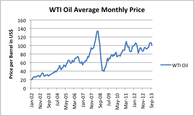
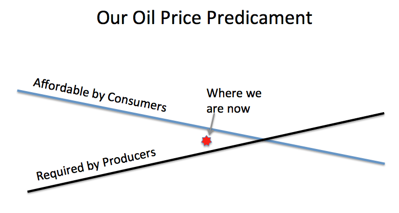
While the author does not flat-out say it, if you take a look at the oil price trajectory since roughly the beginning of 2011, you will notice that it is periodic, and that it appears to be defined by upper and lower bounds. In mathematics, these would be called the superior and inferior limits (limsup and liminf, respectively). These limits are converging, and models defined by these qualities yield functions such as

y(t)=[Ae^(bt/2m)^2][cos(ωt+φ)].

(This model is based on the damped periodic motion model, but with the hyperbolic limit converted to a parabolic one. A result of this is that the limsup and liminf are not linear the way they are in Gale the Actuary's visual model, but rather quadratic, with shared minima at the origins. Such a model is not as exact as I would like, but I have not yet been successful at specifying a periodic function with linear limits whose slope is nonzero. Of course, other possible permutations exist; for example, what we are treating as the origin may be more like a wave node.)*

In the math, there is a symmetry about the origin. But in reality, the problem is that the secondary feedbacks break this symmetry; the model after the origin would be dramatically different than prior to it. It does not matter what the space between the "Affordable by Consumers" function and "Required by Producers" one is, as long as what is "Required By Producers" is in overshoot of what's "Affordable by Consumers". In reality--and this is likely what Gail the Actuary's article is getting at--once the crossover is passed, producers will be forced to sell product at a price in line with the liminf; the instability of this model would, at first, be hidden via leveraging, consolidation, and conglomeration, but would ultimately exert itself through a breaking point--most likely systemic insolvency.

2. One of the commentators on the late site The Oil Drum held a certain optimist viewpoint. Energy was more expensive in the past, during the coal era, while society and the economy were vibrant; why, then, he argued, should more expensive energy cause economic contraction?

The problem is that he was right and wrong at the same time. I would like to propose a hypothesis: that the story of the Industrial Revolution was a reduction in the overall net cost of energy. However, this cost bottomed out in the era 1945-1970, the era of cheap American oil; the oil embargo and its aftereffects allowed us to leverage this cost into the future, but what I propose is that a model of the real cost of energy would show that that it has behaved like a Gaussian function--an inverted bell curve, in fact--and that we are now far enough beyond the point of local minimum to see this and not mistake it for a logistic curve or decaying exponential function. Something like

y(x)=-ae^(((x-b)/2c)^2)+d,

where d is the "normal" cost of energy the curve is asymptotic to, e is the transcendental number, and a, b, and c are other parameters.

For the argument I wish to make, however, we can approximate the curved element of the function as a simple quadratic, say

y(x)=x^2/4-x+3

The reason we'll do this is because the problem with this commentator's argument is that it ignores the change in the cost of energy over time: that is, it treats this cost as a static element. If one derives this function, dy/dx=x/2-1 via the power rule, to obtain the slope of the tangent line, and utilize this to find its behavior at, say, y(0), one will quickly see that such a line is negative. That is, prior to the minimum, the net cost of energy is decreasing. And of course, after it, it is increasing.

As much of the current economic system is predicated on the assumption that said cost is always decreasing (assuming it can be modeled by y=-x^3, whose derivative, -3x^2, always yields a negative tangent line, maybe?), creation of, and access to, flows of capital would have been significantly easier even when the net cost of energy was higher if its change over time was a decrease. In a post-Peak Oil era, that net cost is always increasing--if we are lucky, we might be able to apply enough renewables to the overall mix for it to balance at a level lower than its c. 1600 cost--but, because of this fact of elementary calculus, dependent secondary systems with flawed assumptions about the nature of the primary system will be unable to adapt to the new status quo.

This does not, of course, translate into a "doomer" argument, such as the ones Mr. Kunstler is fond of. Instead, it merely states that dependent secondary systems on the cost of fuel must adapt to changes in the trajectory of the primary system, or fail. The issue at hand is, what are the necessary adaptations? Doomers are fond of pointing out the structural weaknesses that they believe end in failure; they are much less fond of considering the consequences of this change in trajectory, and the adaptations needed for the dependent systems to continue working. It's this latter line of inquiry I find much more interesting.

*NOTE: One of the effects, the asymmetry about the origin, becomes clearer if one cubes the squared exponential parameter of e, i.e. y(t)=[Ae^(-(bt/2m)^3][cos(ωt+φ)], with the core remaining the damped periodic motion model. Cubed limsup and liminf also do cross over, an issue inherent in the squared ones. This model, however, flatlines after the origin, such that it becomes effectively impossible to use it to tell anything about what happens after the crossing point.

Tuesday, September 3, 2013

Width, and the Perception of Width

This has also run on Strong Towns and This Old City; these are the permalinks for both.

Looking at these two links--Hector Street, Conshohocken, and 6th St., Bella Vista--which is wider?
Looking at these two links--Broad Street, Philadelphia, and Avenue Kléber, Paris--which is wider?
Looking at these two pictures--
--which is wider?

The answer is neither. In each example, both streets are the same width, but the way the width is expressed is different. The middle example is, of course, familiar to Stroad to Boulevard readers; let us concentrate on the bottom example.

The top photo is of a complete street in the Netherlands. It has two travel lanes of 10 feet, a parking lane with tree bumpouts of eight feet, and ample bike and sidewalk facilities. Its Streetmix profile is thus
where the planter+tree on one side represents the bumpout, and the parked car on the other the parking lane. Visualize the tree above the car, and the car below the tree, to get a better idea of how it looks in reality.

By contrast, the US complete street's Streetmix profile is
Notice how scrunched up the sidewalk is, and how vulnerable the cyclists.

Both examples have nine-foot sidewalks and eight-foot parking lanes. In the Netherlands, the travel lanes are only ten feet wide, and the cycle path looks to be eight feet; in the US, the travel lanes are 12 ft. each, and the cycle path is six feet. Both add up to 70.

But also notice how the placement of each use in the street communicates information about it. In the US example, cars are clearly given priority, not just by being given wider travel lanes, but also because the bike lanes are placed in such a manner as to expand the travel lanes' clear zone. There are no bumpouts, and so the trees are scrunched along the curb, and pedestrians forced onto the sidewalk. Of the seventy feet, a whopping 52 is part of the car realm, just shy of 75%. This means that for every unit of pedestrian space, there are four of auto space, a ratio of 1:4.

By contrast, in the Dutch example, cars are clearly subsumed. The travel lanes are narrowed, and the parking lane is interspersed with bumpouts; the parking lanes now become the edge space. The bike lanes have been pulled away from potential conflicts, and widened slightly. The sidewalks remain the same width, but there are no trees to present barriers. In this example, a mere 36 feet of seventy is part of the auto realm, if you count the bumpouts as also part of it, giving a ratio very nearly 1:1.

Just as the optimal building height/street width ratio is 1:1, so too is the pedestrian realm/auto realm on a street. This ratio seems to be paramount in the psychological assessment of street width. Hence we can do the analysis we just did for a typical Dutch arterial vs. a typical US Main Street, and still get questions like

Why streets in the US are so wide?

There is space for two row of parked car on both sides and about three times the width of a vehicle in the middle. But technicaly there is no need to park on the road because most house have one or two garages and a lot of space in front of them. I think that`s a waste of space and structure.
and answers like
Because until a few years ago, people looked at safety data from rural roads, and found that roads with 12 ft lanes and wide shoulders had fewer crashes. So, they applied this to residential streets, and guess what? It hasn't worked. Instead of being safer, people drive down these streets as if they were on rural highways, at speed much too fast for neighborhoods.

In the future, you'll see roadways designed more closely for the functions they play in the overall road network, with narrower city and neighborhood streets.
The psychological assessment of width the commentator exhibited is what I am calling perceived width, or alternately the perception of width. Unlike absolute width, which is determined by the lot lines, perceived width is determined by the modulation of the street--how much is given over to cars and pedestrians (and whether bikes are treated as cars or pedestrians)--as well as setback depth (if any). Optimal modulation has the two major users evenly split the street, and setbacks, if they exist at all, be purely ceremonial (no more than 15 ft. or so), or be shielded by an edge along the lot line, created by trees or bushes. We'll assume no setback, since that kind of space is usually (a) green and (b) in the public way of neither. That is, it is neither of the auto realm nor of the pedestrian realm.

Cars need a spatial minimum. The absolute minimum is often thought of as ten feet a travel lane, and eight feet a parking lane; parking lane accesses can, however, be nine feet. Give-way streets need slightly wider travel lanes, so that the car giving way can pull into a space without having to go through a full parallel-parking maneuver. Let's say 14-18 feet for them.

Let us now turn to our first example. Both streets are fifty feet, with ten-foot sidewalks. This implies that both can support give-way traffic; neither does. The Conshy example, however, hosts a bus and thus cannot be pedestrian-prioritized space--that is, a home zone. The design given to it is therefore nearly optimal. This is what it looks like on Streetmix:
The bumpout is irregular, with four parking spaces between each one (on each side of the street). In this, it's like a slightly less verdant example of the Dutch complete street. This design offers a wider walking area than the Philadelphia example:
Both designs, while good, are, however, inferior to
which uses the bumpout/parking strategy to increase available space without losing trees, but in addition narrows the travel lane and adds a cycle path. In this design, 26 feet are part of the auto realm, and 24 the pedestrian--as close to a 1:1 ratio as a 50' street is likely to get.

The second example contrasts Philadelphia's Broad Street--a classic example of a grand avenue converted into a traffic sewer arterial, with Paris' Av. Kléber. The former looks like
this on Streetmix
and the latter, this.

I find myself going into Stroad to Boulevard territory here: notice that there is 30' of pedestrian realm on either side of the street, versus 16' on Broad Street. The bike and parking functions are both elements of a single shared service street, which the sidewalk spills onto; transit islands can also be installed on the green medians separating the two realms from one another. The bottom line isn't just that there is more people space--and less car space--on the Av. Kléber; it's also that one perceives of the Av. Kléber as being more humanized, and narrow, than one does of Broad, which feels more autocentric, and wide.

The perception of width is the psychological element of street design. Psychologically more humane streets tend to attract more pedestrian activity, and more small-scale, innovative, and experimental economic uses catering to pedestrians. It is, at engineering scale, the same thing a parklet signals: the idea that people care about the street as a street, and not just a place for automobile movement and storage.

Saturday, July 6, 2013

More Cogent than I

While still an undercurrent in urbanist media, people are starting to take note of our fundamentally broken approach to passenger rail safety. This item from the usually-libertarian Competitive Enterprise Institute, for example, hits the nail on the head. It's extremely short, only seven pages, and describes more cogently and Steve Smith, or Alon Levy, or I, the challenges facing American rail transportation professionals.

The problem remains that this remains an issue that is unknown, and hence unremarked-on, by most people outside the profession and geeks whose interests tend that way. It also doesn't help that, as Business Insider points out, politics get in the way. This is an ongoing problem with land-use issues: it is very difficult for technocrats to reevaluate and rebuild fundamentally broken regulations when they are opposed by people who know those regulations are broken, and fundamentally just don't care, who would rather leave them in place to laugh at them and say they should be repealed outright* and say "this is why government is broken" rather than pitching in, lending a hand, and fixing them.

All that said, I find myself nodding in agreement with Edmonson and Scribner in their recommendation that
[i]f the FRA insists that the operational environment of the Untied States is uniquely dangerous, it should overhaul its regulatory mandates and take a step back from the prescriptive rules currently in place. Instead, it should create a series of performance metrics that would allow train designers to innovate. It now asks, “Does this train fit our rules?” It should ask, “Is this train survivable in a crash?”
 
This would allow U.S. transit authorities to purchase not only European trains, but also Japanese trains, which are designed to different effective standards. The United States could be a melting pot of train designs from around the world.
It can be done. But do we have the political will to do it?
______________
* Although, with the current FRA regulations, and the (nonexistent) state of our domestic passenger railcar industry, one can actually argue for its dissolution (as Alon Levy has in the past); European and Japanese products, the bulk of the market, have proven safety records our lemons don't.

Wednesday, April 10, 2013

NPT Card Accessibility

Short and sweet.

Make sure there are facilities to dispense and charge NPT cards at every single subway, El, Regional Rail, NHSL, and 101/102 stop.

Make sure there are facilities to dispense and charge NPT cards at every single Subway-Surface stop in the tunnel.

Make sure there are facilities to dispense and charge NPT cards at every single Subway-Surface loop.

Make sure there are facilities to dispense and charge NPT cards at principal bus nodes--anywhere, except for Center City or on the Frankford Terminal approaches, where three or more bus routes come together. This includes Wissahickon Transfer, the Ogontz Loop, Franklin Mills, King of Prussia, Penn's Landing, Front & Market, Whitman Plaza, Andorra, Plymouth Meeting, Willow Grove, and so forth. Additionally, ensure that NPT dispensaries are available at principal jobs hubs, such as HUP.

The goal is to maximize user accessibility, maximize ease of use, maximize user confidence.

Tuesday, April 9, 2013

What Oyster Teaches Us About Fare Collection

How it's done:
SEPTA's NPT wants to act like London's Oyster Card, but with an open platform. Many Oyster best practices are thus best practices SEPTA needs to implement.

1. Tap in, tap out. SEPTA's current NPT Regional Rail policy is extremely convoluted and commuter-optimized, essentially giving free fare one way in exchange for double fare the other. Anywhere where there's a viable workaround, this will ensure overloaded trains on the free side and empty trains on the double-fare side.

Instead, Oyster uses a validator system, which is just an electronic update of a proof-of-payment system. Proof-of-payment systems are tried and tested, and are in use on the River Line and throughout the MBTA and most newer commuter-rail and light-rail networks. And best of all, they can be policed in the same manner as other proof-of-payment systems--just check and see if the card is indeed showing an active trip  being taken, and fine the holder if not--like a transit traffic ticket.

2. Guide to workarounds. Another issue NPT has is zone implementation. Annoying, but the only alternative is a per-mile fee. Instead, use an Oyster-style intrazone transfer system. On the Oyster, where route transfers can avoid zone surcharges, pink transfer gates are installed, allowing for free transfers and cheaper routes. Think like at 69th St. or Fern Rock, here.
3. Fare cap. Right now, SEPTA wants NPT to have a trip cap--200 a month. Asides from "unlimited" cards getting in trouble with laws and stuff about false advertising, this is rather the wrong way to go about capping. Instead, cap fares. Oyster caps fares at a peak (or off-peak) (round-trip?) ticket of the highest fare used during that day. Since most London transfers are free, this (incidentally) caps Michael Noda's Upper Darby trip at $5.00 (assuming NHSL round trip, $0.50 "premium", and round trip fare capping) or $7.00 (assuming 123 round trip, $1.50 "premium", and round trip fare capping). His hypothetical fare peak at $11.50 would cease to exist.

Keep in mind the fare capping system I am proposing caps fares at the most expensive single round trip fare used. So if Mr. Noda went to Upper Darby but caught the 104, the fare cap would remain at $4.00 (since both the El and 104 within Upper Darby Township charge a $2.00 cash fare).

Of course, the problem of excessive "premium service" cost for the 123 remains, but a fare capping system makes it more bearable.

4. Make it easy, make it easy, make it easy. This needs to become a mantra. Make it easier on the user, make the system more transparent, and don't unfairly penalize folks who don't have a card. On the other hand, make it easy and natural for everyone to have a card--much like the average New Yorker's wallet has an MTA card, and the average Londoner's an Oyster Card.

Monday, April 8, 2013

A Tempest in a Teapot

I must admit, I was wrong. Full of sound and fury, signifying nothing.

Some time ago I went on a rant about how SEPTA and PATCO need to coordinate fare media. They do; so do SEPTA and DART, SEPTA and NJT, and NJT and PATCO (I do not think any NJT route goes over the Delaware Memorial Bridge).

My mistake is that I had assumed--based on very old information--that the Freedom Card had been built on an open platform. It is not. It is built on the same closed-source platform e.g. London's Oyster Card is.

By contrast, SEPTA's NPT is to be built on an open platform--and this, incidentally, will make it first in the nation to be--and so requiring it to be compatible with a closed system is significantly more technically difficult than the examples I've given previously, both here and on Michael Noda's blog. This does not absolve SEPTA completely--you can totally run (closed source) Microsoft Office on (open source) Linux running Wine, for example--but there's a second development that makes me wonder.

PATCO is jonesing about replacing its existing Freedom Card architecture. That makes me wonder: 1. Freedom Card, as it is, is all of five years old, hardly enough time to become technically obsolete (unless, you know, you're Microsoft or Nintendo), and 2. a fairly straight port of Oyster Card technology--you know, the same Oyster Card that is the model of how to do (nearly) everything right. But the news that PATCO is jonesing to replace Freedom, coming out as it has in the thick of NPT, strongly suggests to me that that move isn't meant so much to replace Freedom per se as it is migrating the Freedom architecture onto something compatible with NPT's open-platform architecture.

I'll repeat: the mistake I made was assuming Freedom was open-platform. If it was, that would put compatibility onus on SEPTA. But it isn't, and since SEPTA's NPT is to be open, that puts compatibility onus on PATCO. And from what I've heard, PATCO is being proactive about it. Thankfully.

Monday, March 18, 2013

The Outsize Value of Fare Coordination

or, why NPT and the Freedom Card need to be compatible

a working paper à la Nate Hood

"Organization before electronics before concrete" is an important German concept that refers to both a means of subdividing solutions and a philosophy for applying those subdivisions. The best solutions have the most impact for the money, after all, and the ones that have the most impact are generally those that cost the least to implement properly. Note adverb: Cheapskate "solutions" generally tend to fail. Since we are looking at proper solutions, and it follows that those with the highest cost-benefit ratios tend to be optimal in any circumstance, this means that "organizational" solutions, with an extremely low capital cost* relative to benefits. Because of this, fare coordination is an essential organizational problem, and one which, when implemented properly, contributes massively to systemwide user-friendliness.

This can be directly applied to SEPTA's NPT travails. User desires for NPT are fairly simple--one card to get where you're going, no matter on what or when. One card for any train to Trenton, Wilmington, Downingtown. One card that connects to PATCO and the River Line. One card that does it all. London's Oyster system is a template.

Why is it so hard to just follow a goddamn template?

SEPTA's working protocol for NPT is generally commendable: contactless, open-loop, easily integrated with next-gen credit and debit cards^ like Tokyo's Suica as well as other next-gen fare systems. But that's where its technical edge comes to an end: NPT is attempting an (untested) rollout of Regional Rail fare payment that is not at all in accord with the best templates (e.g. Oyster, which uses a modified proof-of-payment system)--something which I'm sure Sic Transit Philadelphia will give more info on in the near future--and a total failure to integrate the Freedom Card. To hell with fare coordination! sayeth 1234 Market. We want to protect our agency turf at all costs!

Integrating the Freedom Card is basic fare coordination. While it may be more limited than what SEPTA has in mind with NPT, it is not so limited as needing to be back-compatible with tokens. Like what NPT will be, the Freedom Card is also contactless, chip card-based, credit- and debit-card-integrated. It already has features SEPTA has in mind, and was designed to be open-ended enough to be compatible with NPT, predictable since NPT itself is something that has been kicked around for the better part of a decade now. It is Universal Gravitation to NPT's General Relativity. Any implementation of NPT in a fixed-fare environment (buses, trolleys, the subway, el, and NHSL) is going to act, technically, in the same manner as the Freedom Card. So take it as the technical base, and build a variable-fare system on top that works like the Oyster Card! Or, at the very least, make sure it has basic back-compatibility--something that all software developers know full well. It is not hard.

And the users will thank SEPTA. Suddenly, instead of having several agencies at cross-purposes with one another, and discrete fare payment media to match, a single card becomes a gateway to the region. Want to visit the Mercer Museum? No problem! Want to visit a friend in Burlington? No problem! Want to check out that trendy place that just opened in Haddonfield? No problem! It is because, once implemented, fare coordination provides these real, tangible user benefits that even the handful of primitive fare coordination systems in use in the U.S. are expansionary--the Clipper Card, growing at a rate of two agencies a year, for example, or the SmarTrip/CharmCard nexus, which has effectively tied together a fare-coordination network spanning two major cities (Baltimore and D.C.) and the better part of two states. It is because of this that there is only one fare media--the OV-Chipkaart--in use anywhere in the Netherlands. Build a core and other agencies (especially smaller ones which see more significant boosts) will want to climb on.

The point is that while more advanced fare payment systems are more advantageous to the transit agency, fare coordination is more advantageous to the user. And user advantageousness is what, frankly, makes or breaks borderline users, what drives ridership up--or down. SEPTA is not so large as to serve the entire Philadelphia region the way the MBTA is to Boston. If SEPTA truly wishes to make getting around the region using its services advantageous, it must make sure its connections with the regions' other agencies are also advantageous to the user. It must invest in fare coordination.

Unfortunately, it says a great deal about American mass transit that agencies here are obsessed not with implementing proven, and working, templates, but rather with inventing new "standards" that are optimized for themselves and themselves alone (and thus not really standards). All SEPTA has to do with NPT is implement an Oyster Card clone**. Alas, if they keep on the course they're going, they're going to botch it.
____________
* Organizational solutions usually also have relatively high human cost, because the nature of such solutions is that they require agency cooperation and/or integration, a difficult proposition in the U.S. environment where agency turf issues rule the roost. Regulation--requiring all agencies serving a particular metropolitan area to be fare-coordinated--may be a useful workaround, but on the other hand the integration of fare payment media with credit cards (already happening in Europe and Japan^) may well render the whole fare-coordination issue obsolete.
^ For example, D.C., where the SmarTrip system (itself compatible with MTA's CharmCard) is about to be phased out for a credit card-based payment system.
** See e.g. the YouTube link above for why.

Thursday, March 14, 2013

Setting the Record Straight

Somehow it's unsurprising that, in our state's game of political brinkmanship between PennDOT and Amtrak, the right wing supports killing the daily Pennsylvanian. The right wing's op-eds are fact-free tiresome rehashes. So fact-free, in fact, that in an amusing inversion of the norm, the comments are more educated than the articles themselves.

It is interesting that both rags appear to hail from the Pittsburgh area, and of course one--the Tribune-Review--makes the leap that Pittsburgh's ridership situation was symptomatic of the line as a whole:
Total Pittsburgh station passenger counts are falling, and The Pennsylvanian — with just one morning departure and one evening arrival there daily — “almost certainly” is serving “fewer than 100,000 per year or 270 people per day” and losing riders, which means even higher future subsidies, he writes.
Nothing could be further from the truth. Only one Pennsylvanian station suffered from declining ridership last year; as I've already explained, Pittsburgh suffers from a scheduling quirk that necessarily undermines its boarding counts (that is, departures are either too early or too late).
And in direct contradiction to the article's claims,  the Pennsylvanian's total ridership rose last year, as it had the year before and the year before that. The most recent figure I know of is a ridership of 207,016, a 2.2% increase over the prior year. This is not the Fort Pitt, whose ridership was 30 a day when it was discontinued. Rising ridership means more demand for the train--implying the most harmful possible move is to cut it.

Third--again, as I've already explained--the Pennsylvanian is price-competitive to the Turnpike for cross-state trips. It's not I-80 it's competing against. At any given time the effective cost for traversing the state on the Turnpike is a $30 toll plus approximately $30 in gas--that is, $60 total. Yes, the Turnpike is faster to Harrisburg--but the Pennsylvanian clearly supports other niches.
Riding The Pennsylvanian to Harrisburg costs $40 and takes 51⁄2 hours with stops. Dr. Haulk notes that Megabus has three daily nonstop Pittsburgh-Harrisburg trips that cost $14 or $16 and take 31⁄2 to 4 hours.
Dr. Haulk misses the point. It's not Pittsburgh that is fueling the Pennsylvanian in its current iteration--it's Altoona, Lewistown, Huntingdon--places where Megabus doesn't stop. And guess what? Altoona, Tyrone, Lewistown, Huntingdon--all have mid-morning or midday departures! Again, Pittsburgh's ridership isn't suffering because the train is a bad train, per se--it is because the train's schedule is built around convenience for the other side of Horseshoe Curve. Or, to put it bluntly, Pittsburgh's Pennsylvanian ridership is so low because there's only one Pennsylvanian--and it's oriented to Philadelphia.

Don't agitate to cut a useful service for Altoonans, Tyronians, Lewistowners, and Huntingdonians, friend Pittsburghers. Agitate instead to add a train useful to you.

But it's the Sentinel that commits the most grievous sins. When it says
If the state’s going to spend money on rail transportation, it should do so where money would be better spent. Continuing to upgrade the Harrisburg-to-Philadelphia line, or investing with NJ Transit on plans to bring commuter rail to the Scranton area, seem more palpable than maintaining money-losing service to Pittsburgh,
it is comparing apples and oranges (at the very least). The Keystones are (supposed to be) hourly service; naturally, when the train comes once an hour instead of once a day, it is significantly easier to take it. Lancaster demonstrates this. The still-a-long-ways-away NJ Transit Scranton proposal would probably not even be hourly past East Stroudsburg. But these trains run as corridor commuter trains. The Pennsylvanian is, at its heart, an intercity train linking Pennsylvania's two great urban heartbeats.

The sad thing is that the Sentinel bulldozed through the truth on its way to its fatuous conclusion.
Rail experts say that the line could prove profitable and popular one day, but getting there would require tens or hundreds of millions of dollars — some subsidized at the federal level, to be sure, but some on the backs of Pennsylvania taxpayers — to realign and straighten the route to allow for high-speed access.
Probably Almost certainly not the best quote, given that running speed can be brought up quite a bit in the current infrastructural envelope--but this, at least, hints at where we can start. It is not eliminating what is very much a useful service; it is not by investing the many billions of capital needed to make it full-fat HSR into the line whole. It is by incremental additions, incremental improvements. You can't justify infrastructural investment by divesting the infrastructure you already have.

And the first of these improvements is a second daily train, oriented to Pittsburgh rather than Philadelphia. Do that, and be surprised by how suddenly useful the train becomes.

Monday, February 18, 2013

Putting Pieces Together

This emerged as a comment to this Old Urbanist post, but was rejected because of its length:
So the conventional theory is dead wrong; the data show the actual catalyst occurred during WWII. (Interestingly, there seems to be a strong correlation with home ownership and car ownership between the 1920s and 1950s; secondly, car ownership rises abruptly after WWII and surpasses the home-ownership rate.)

This, of course, begs the second question which the automotive theory "solved": the postwar collapse of the American city. My guess is that it was a combination of factors--some still at work--including a desire to emulate lifestyles portrayed in entertainment media, race, inefficient/incompetent/oversized city government, and even the ability to "cash out".

Think about it for a moment: the initial homeownership boom occurred BEFORE the Levitt brothers started their tract community, BEFORE detached housing became regulated as the dominant and standard housing type in zoning codes. If the initial catalyst for the homeownership surge was owners taking their properties off the rental market to avoid wartime rent controls, then it also stands to reason that the following sequence of events could have taken place:

1. Some owners, owning a property that was converted from apartments to a family property, would add supplementary income by renting out unused portions of the property.

2. For other reasons, some of them related to the ease of acquiring FHA mortgages, households engaged in this activity would buy a new (suburban) property, while continuing to rent out the existing property for supplementary income.

3. The Great Migration's second wave began in force after WWII. While urban families were enjoying unprecedented prosperity, the Migration would begin to control the demographics of the rental market.

(By the way, the first major wave of the Great Migration, in the 1920s, was probably catalytic in the imposition of zoning codes in the first place.)

4. Urban neighborhoods at this stage are composed of an even interspersion of homeowned and rental properties. However, a knock-on effect of the Great Migration is an intense demographic change in the rental market. Demographic mixing begins to take place, due to the ownership matrix, in a wide variety of neighborhoods.

5. Sociological norms take over. This was the nadir of American race relations, after all. Owners who had previously primarily invested in the city purchase elsewhere; some may convert their existing property to rentals; others panic-sell, driving the total stock into the hands of a few larger landlords aiming to make money off of the rental market.

6. The Great Migration creates an intense rental demand. Sociologists analyze the patterns occurring in existing neighborhoods as another example of invasion and succession (which it is.)

At this point, we can see why the demographic changeover occurred, but not the urban collapse. But the major collapse didn't happen until twenty years after WWII, which implies a delayed effect. It also happened concomitant with an (generally unremarked) failure in the financial system at large--the stagflationary period--which was remedied not by any great change in structure, but by increasing leverage (i.e. debt). This, in turn, would be the ultimate causor of the 2007-8 meltdown, as the scope of leverage grew to a level too great to bear.

This financial system was rearranged, by the way, beginning in the late 1920s. It shifted from a bipolar system that largely existed in the form of B&Ls and other small institutions that funded small-scale improvements in local neighborhoods, with a handful of large investment banks whose financial structures had been built to proffer vast streams of capital to the likes of the Goulds, Rockefellers, Vanderbilts, at the other end...The Great Depression was catastrophic on the smaller end of this market, and eventually produced regional- and national-tier institutions. Neighborhood finance had died by the end of the Great Depression. These new regional investors (a combination of larger neighborhood banks, smaller investment banks, and a few regional banks which had existed before), out for profit, in turn practiced a targeted investment strategy (which we today know as redlining).

The targeted investment strategy targeted investments which were focused around certain types of investments the Federal government heavily favored--FHA mortgages and the ancillary infrastructure--to the exclusion of all others. The system became efficient but fragile. The system failed--stagflation occurred--when Mother Nature presented Uncle Sam with the bill for maintaining that ancillary infrastructure (per Strong Towns).

But, because there were no local investment vehicles--the role traditionally performed by neighborhood banks, B&Ls, small-scale S&Ls, etc.--there was no capital available for areas disfavored by banks' targeted investment strategies. What had happened, if you think about Jane Jacobs' The Economy of Cities\, was that capital had become amazingly efficient, but it had ceased to be productive at developing a new middle class. With a dearth of capital, and an inability (due to Federal regulations) to develop neighborhood capital vehicles, the middle class that should have developed under traditional invasion and succession theory did not; urban tax bases began to erode, and cities found themselves in financial crisis. Collapse happened.

To recap: American race relations had created a demographic turnover structure called "invasion and succession" by sociologists. Like lived with like. Invasion and succession, by itself, explains why American cities became majority African-American during the Second Great Migration.

The Economy of Cities takes it from there, both by explaining how productive economic development happens within and without the invasion & succession framework, and how finance can be productive OR efficient (but not both): an economy can develop, adding new goods and new work, or it can stagnate, replicating existing work unendingly. After the Crash of 1929, the financial system shifted in favor of efficiency over productivity, which over time deprived the African American community of the ability to develop an internal middle class, which, by the 1970s, undermined cities' tax systems to the point of collapse. It is no accident that the highest level of population flight from cities was during those decades.

Wednesday, February 13, 2013

Quick Note about the Daily Pennsylvanian

So PennDOT and Amtrak are engaged in a chicken game for the question: Whose responsibility is it to fund the Daily Pennsylvanian? Neither side is stepping up; each is looking for the other to take on the responsibility of funding it. In all this, naturally, the train--and the service it provides--loses; the worst-case scenario is the loss of a daily train between Philadelphia and Pittsburgh.

Think about that for a second. No train around Horseshoe Curve. No service to Altoona or Lewistown, Johnstown or Tyrone, Greensburg or Latrobe. Several of these towns--principally east of Horseshoe Curve--have growing ridership. Yet ridership in Pittsburgh is flat, even declining.

Why is this? It's a matter of convenience. The train leaves Philly around noon and reaches Pittsburgh in the evening; it leaves Pittsburgh early in the morning and reaches Philly in the early afternoon. It takes 5.5 hours to traverse the Appalachians, from Harrisburg to Pittsburgh. The Turnpike takes the same time to get you all the way there.

So--inconvenient arrivals and departures from Pittsburgh, coupled with a convenient alternative; convenient arrivals and departures from Altoona, Tyrone, and Huntingdon, with a relatively inconvenient alternative. That explains the odd ridership pattern we see on the train.

Now, the next element is something lots of people tend to forget: the Turnpike ain't free. In fact, although it's a five-hour trip from Philly to Pittsburgh, it's also $26.50, usually plus overpriced gas at Sideling Hill. Try it for yourself. It's not like the Turnpike has a lock on the market purely because we're subsidizing the road, the way it is for, say, the Buffalo-Pittsburgh market. In fact, the Amtrak fare, $54.00, is price-competitive with the Turnpike. (Think about it: a $30 Turnpike toll plus $30 for gas at Sideling Hill is about the same as a one-way Amtrak fare.) It's not time-competitive, but it doesn't really need to be to begin building ridership; it can appeal to time-rich demographics, like students and weekenders, and start worrying about time-sensitive travelers later. In fact, this is the very way its ridership is growing where the service is convenient.

What it needs to be is as convenient out of Pittsburgh as it is out of Philadelphia and central Applachia. In other words, what it needs is another daily service that leaves and arrives in Pittsburgh around noon, to complement the section that leaves and arrives in Philadelphia around noon. This would better tap the Pittsburgh element of the market, and build a ridership base to make improvements like, say, hourly service to Johnstown or line improvements to 110 mph running speed.

There's a market there. The will to tap it is what's lacking.